
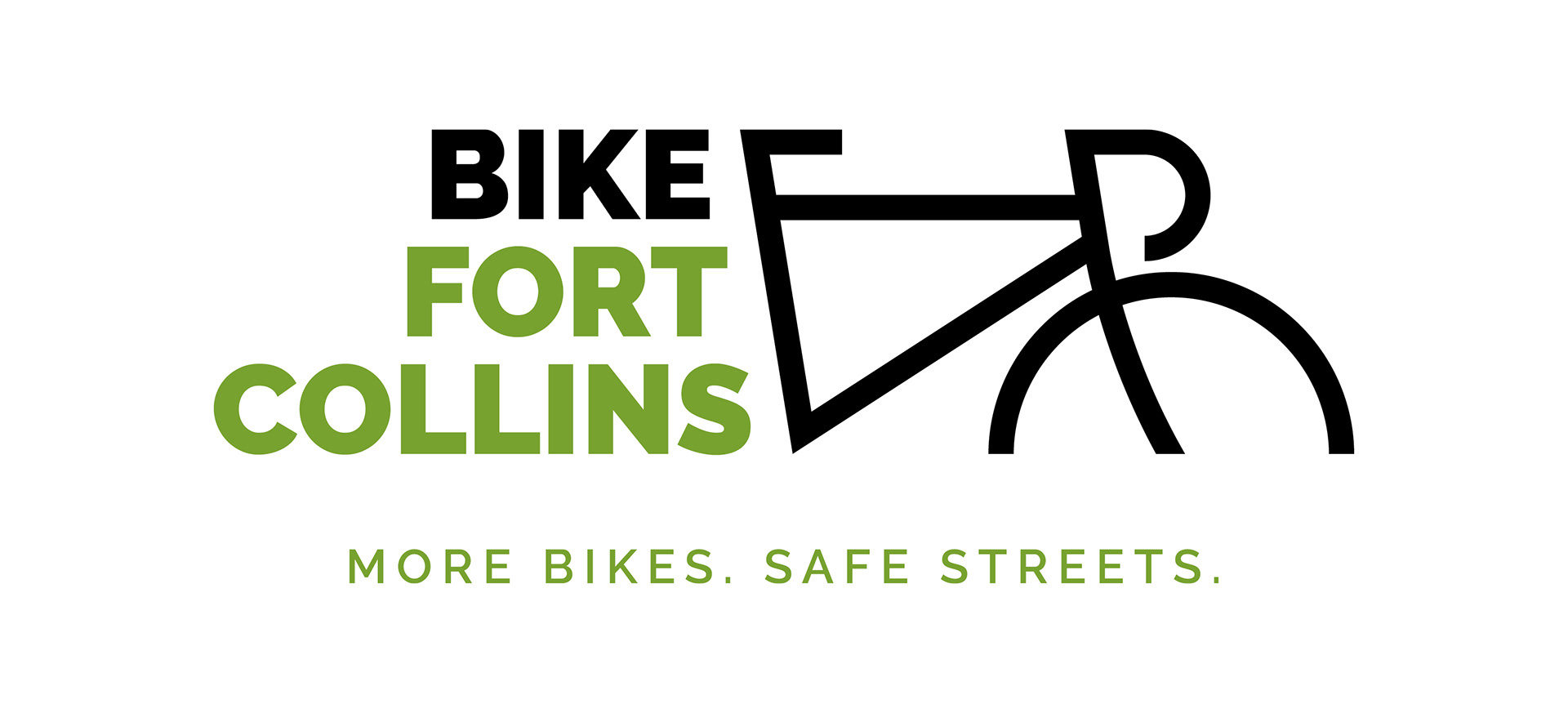
The logo is at once simple and modern, utilitarian and highly adaptable.
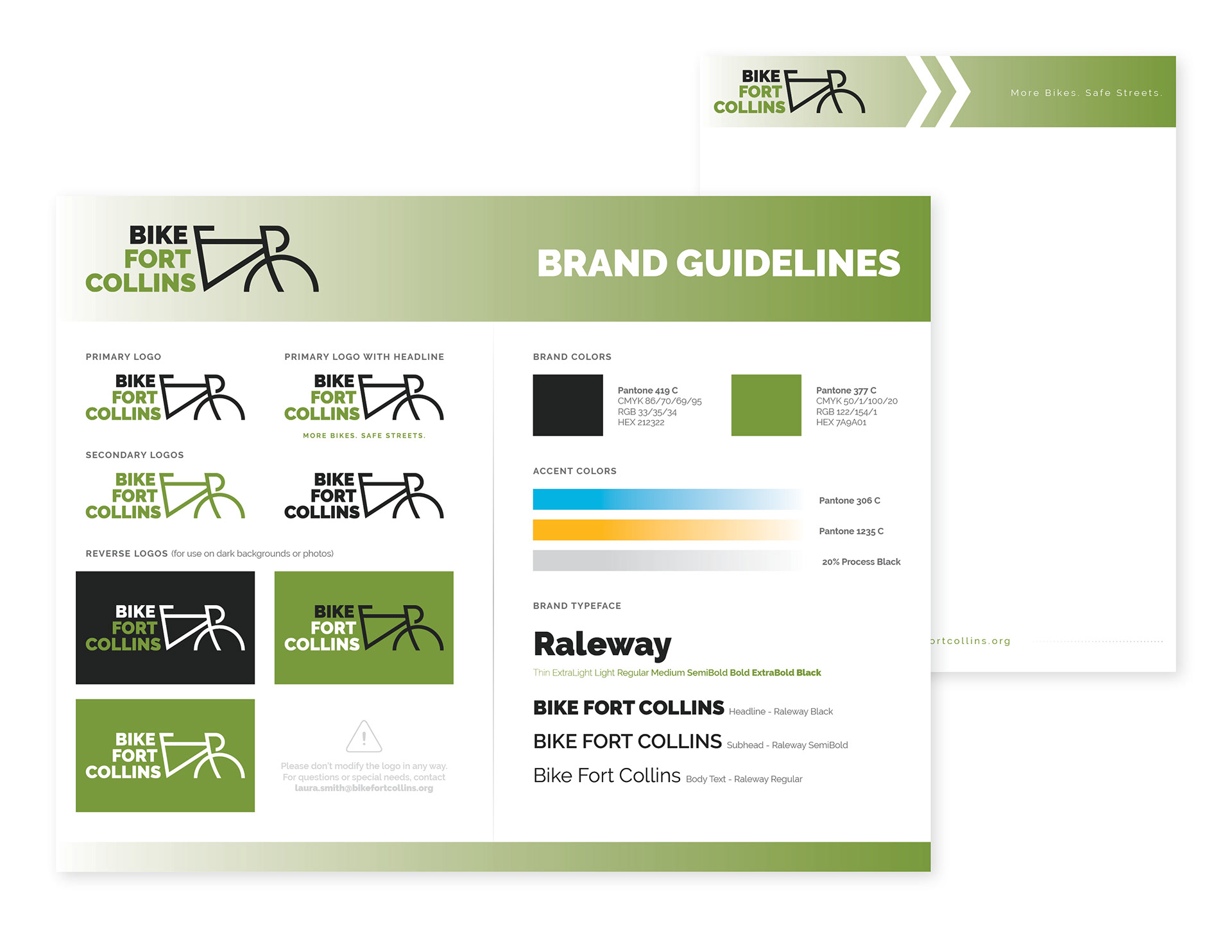
BFC is a non-profit with many community partners, so I knew that the brand guide needed to be short and helpful. I chose Raleway for the typeface as it is a large family that is clean and widely available. A letterhead design is hiding behind the brand guide.
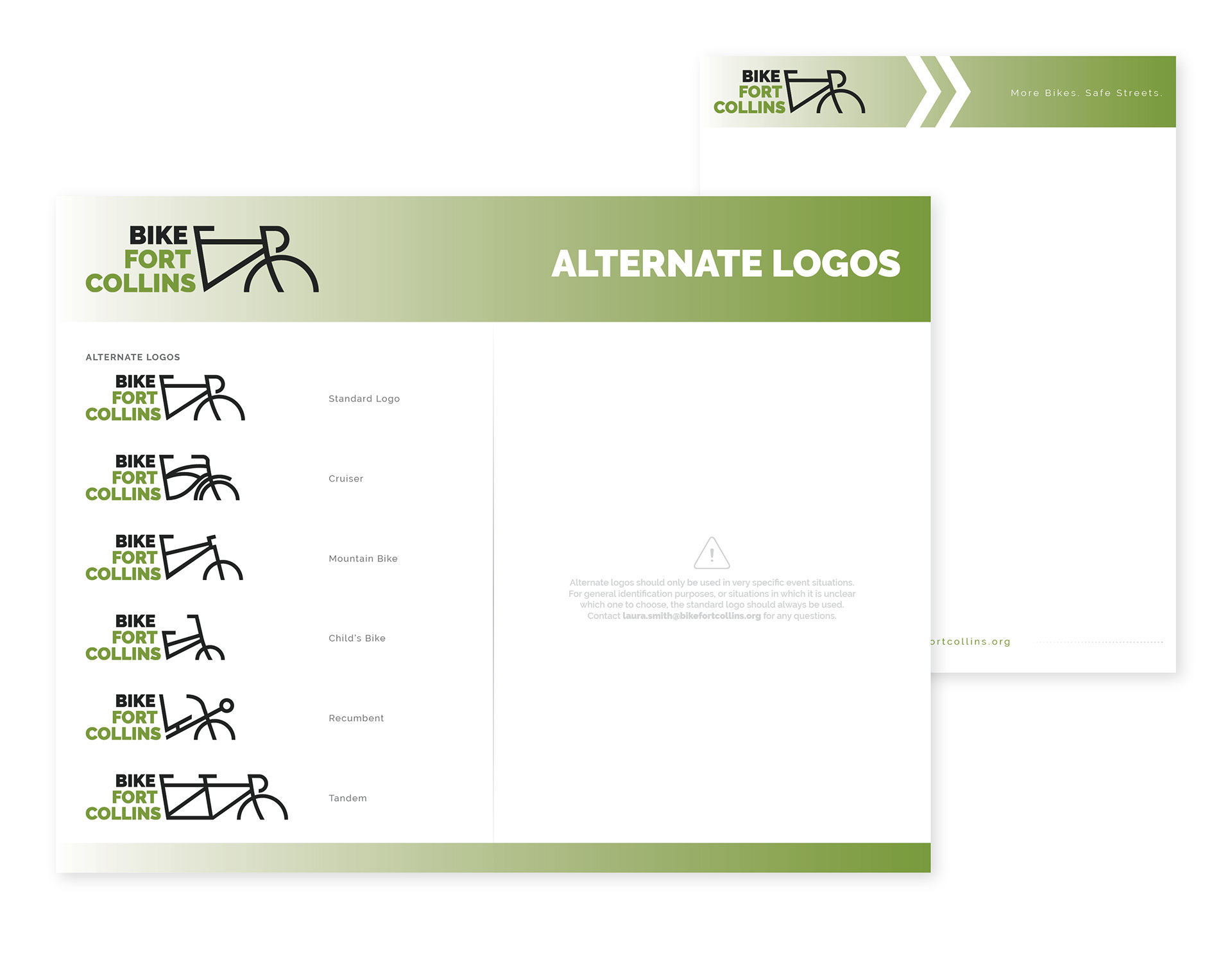
One of my favorite things about this identity is that the logo is adaptable to many different types of bikes. Accessibility is an important part of BFC's mission, and this gives them a tool to speak to more specialized audiences and make all types of riders feel seen and included.
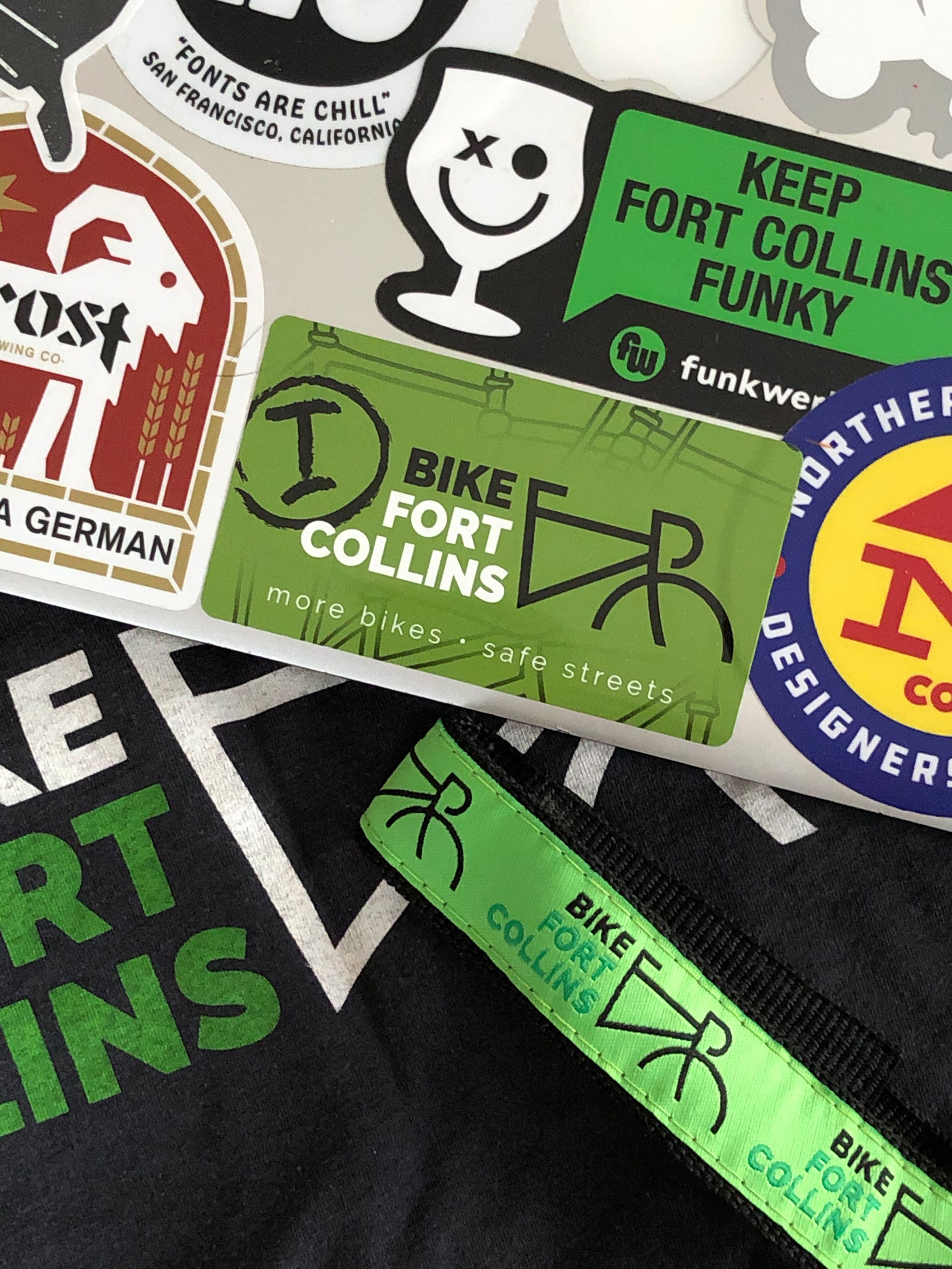
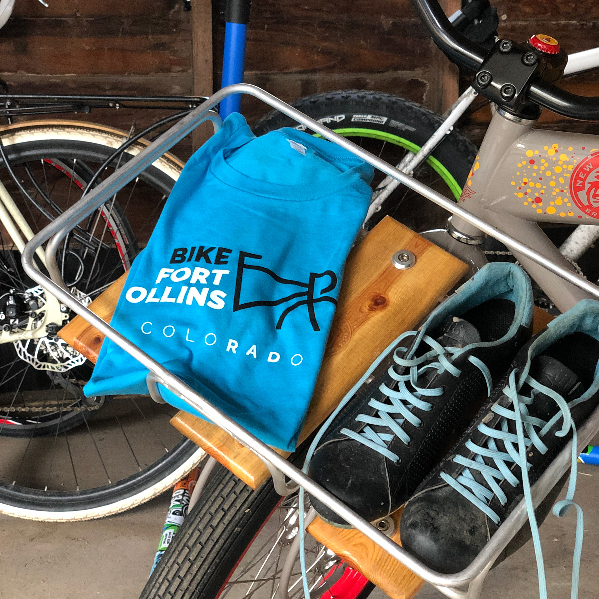
Initial merchandise items included t-shirts, stickers, and ankle straps.
The second order of t-shirts got a little more rad.

The logo reduces extremely well, which is important for smaller giveaway items such as bells and lights.