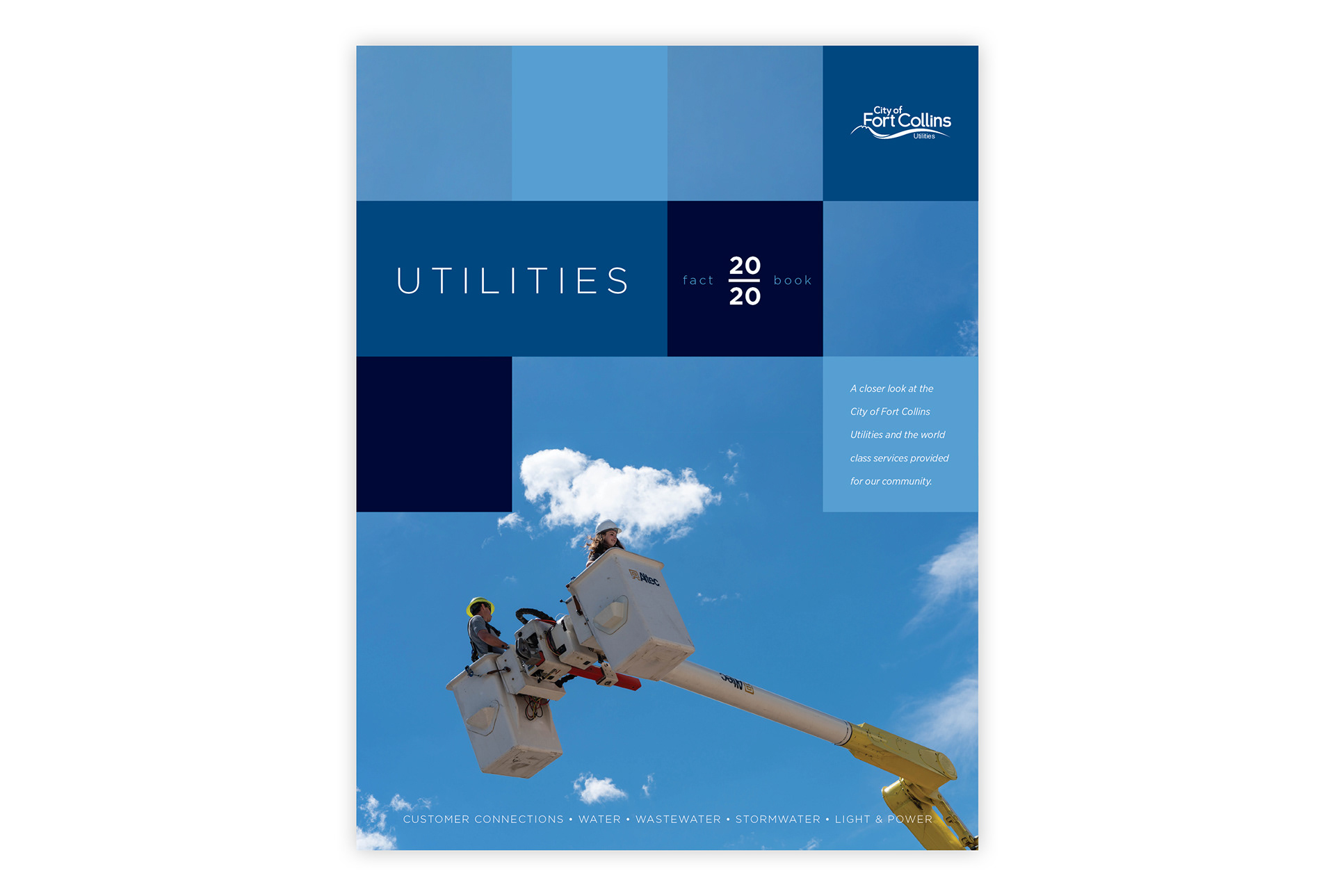
The Utilities Fact Book was one of those projects that got kicked off with a big vision, but ended up getting caught in the limbo of the early days of the pandemic. I'm unsure if it ever got produced, but I happy with this full redesign that I put together. It's loosely based on the concept of 'the grid,' a common term for the utilities networks that keep every city running.

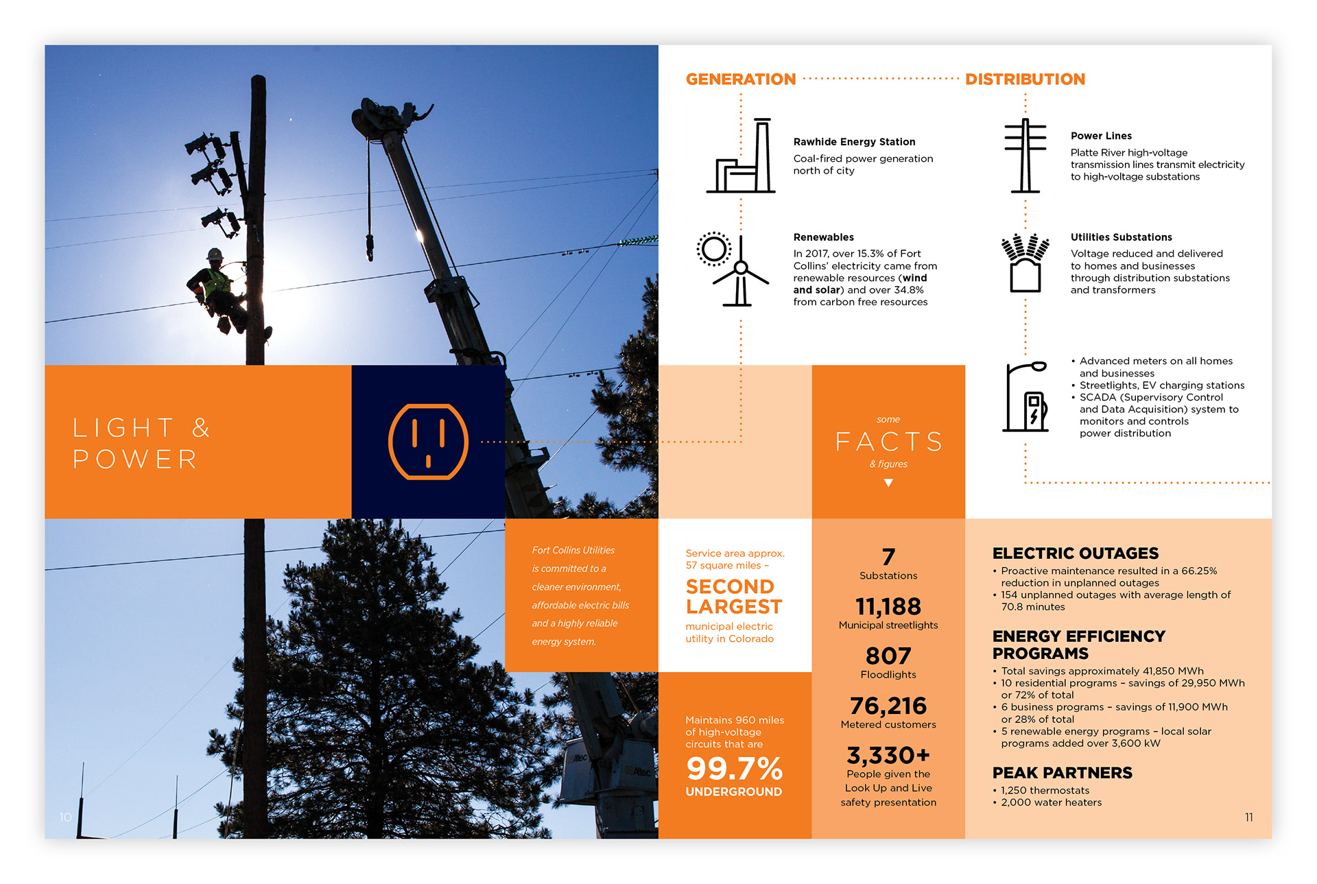

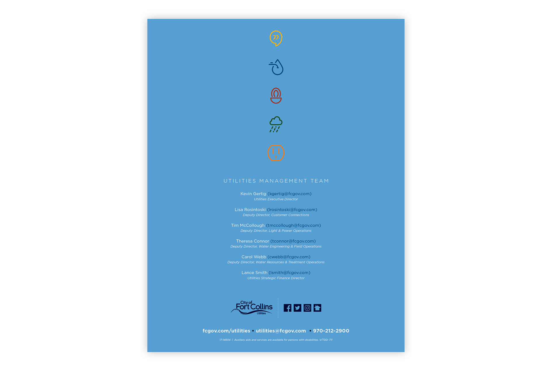
I created a custom set of icons to represent the 5 areas of the utilities department and to aid in the organization of the book.
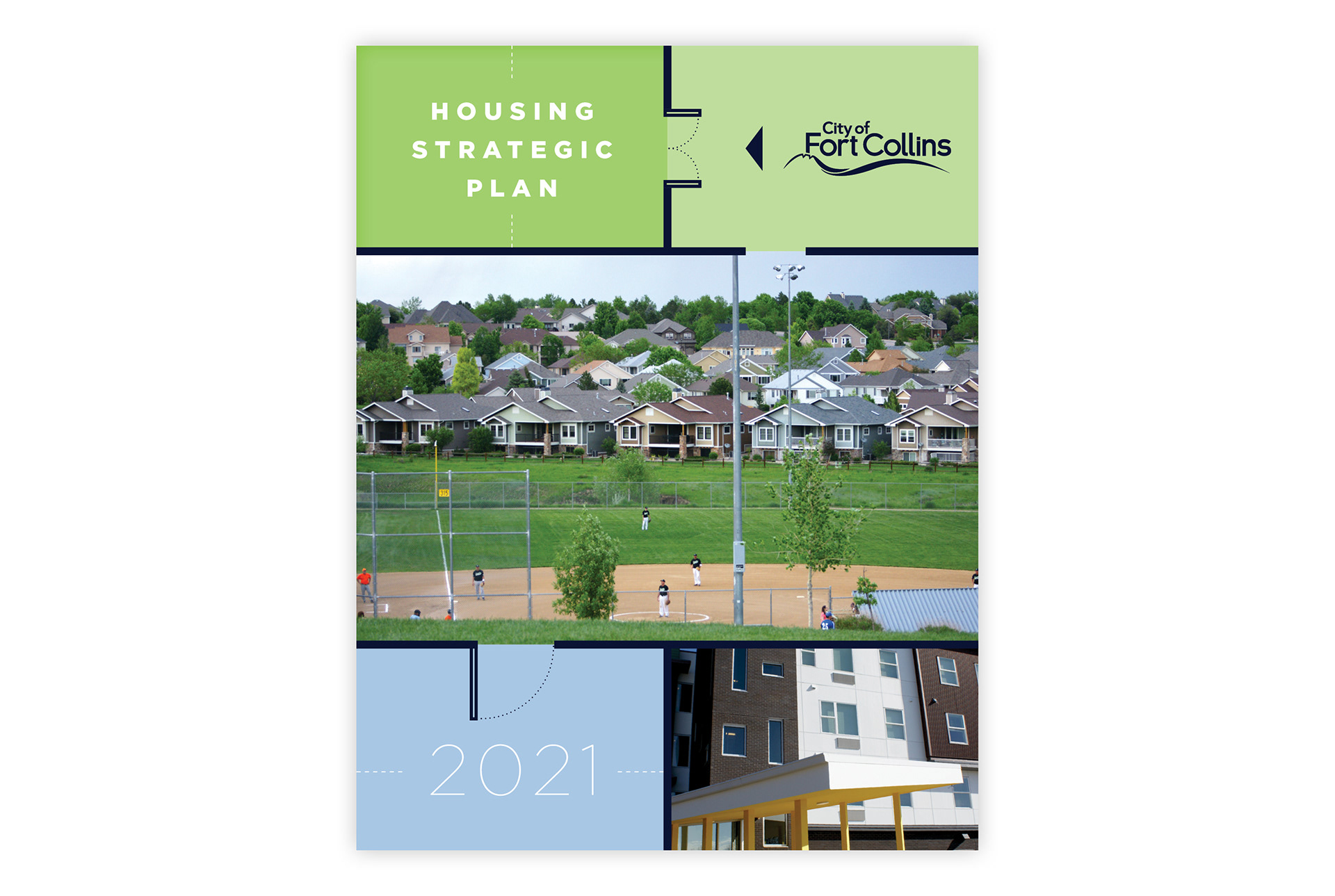
The Housing Strategic Plan is probably one of my biggest achievements from my time at the city. It was a project that we had advance warning for, but had to wait until the very end to get our hands on the actual content. The content was delivered in the form of a word document, which resulted in a painful and tedious design process. In less than a week of very long nights, I delivered this document. Final page count: 174. I learned a lot about InDesign's interactive features during this process, and also learned that the city is full of hard-working people who care very much about solving problems in their community.
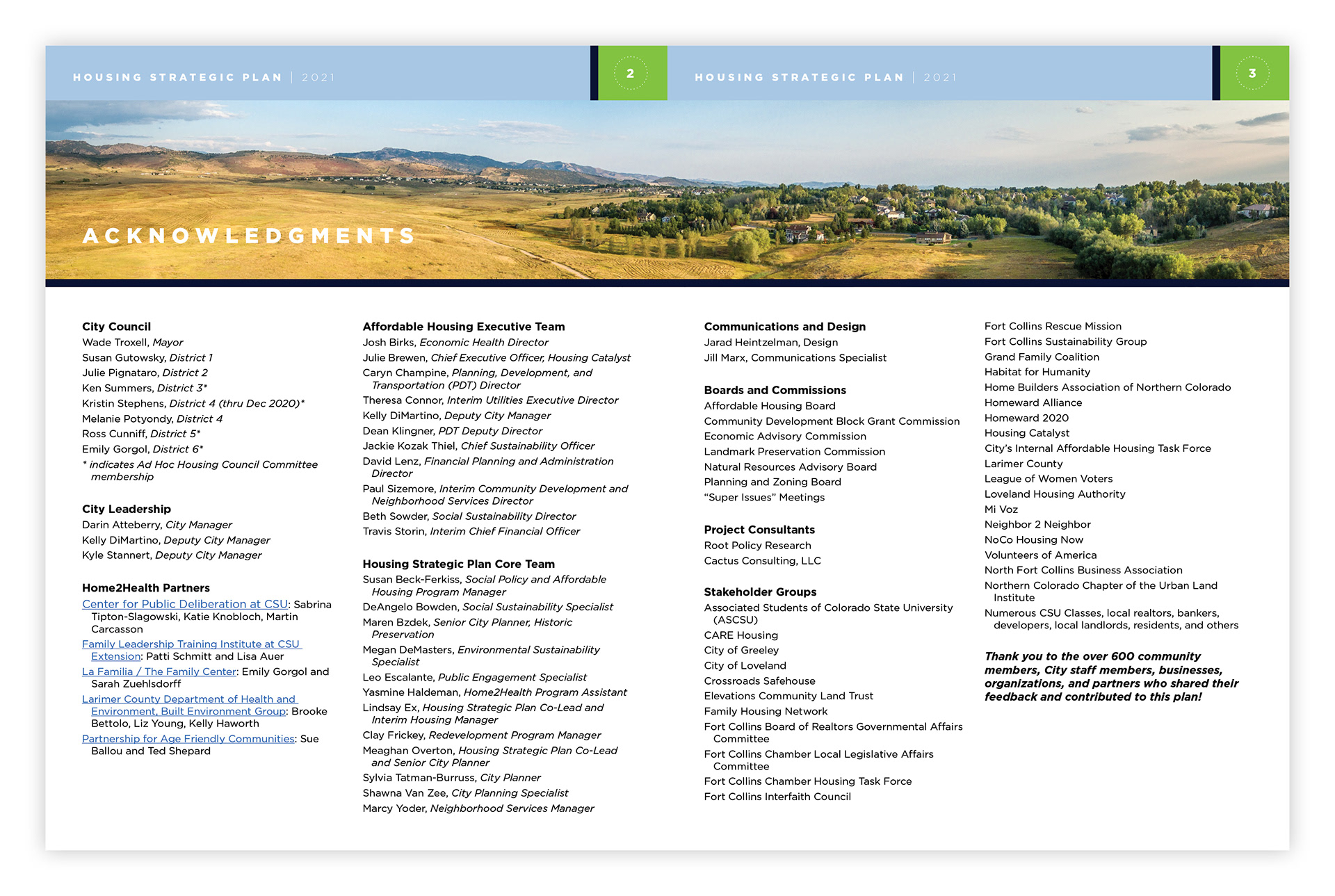
Hey, that's my name! (Along with some very admirable company.)

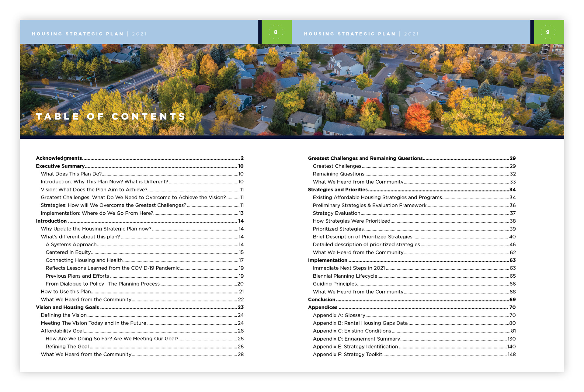
The entire piece is navigable through live links: the table of contents, callbacks throughout the text, and the footnotes are all clickable.
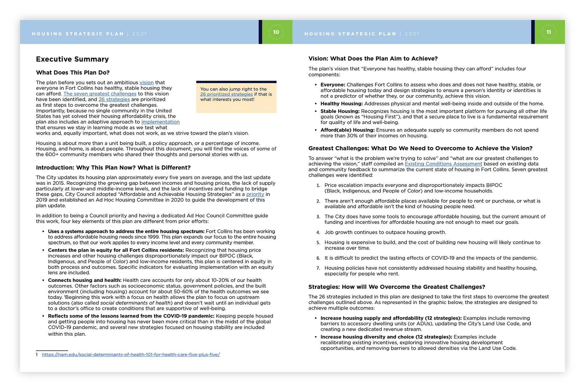
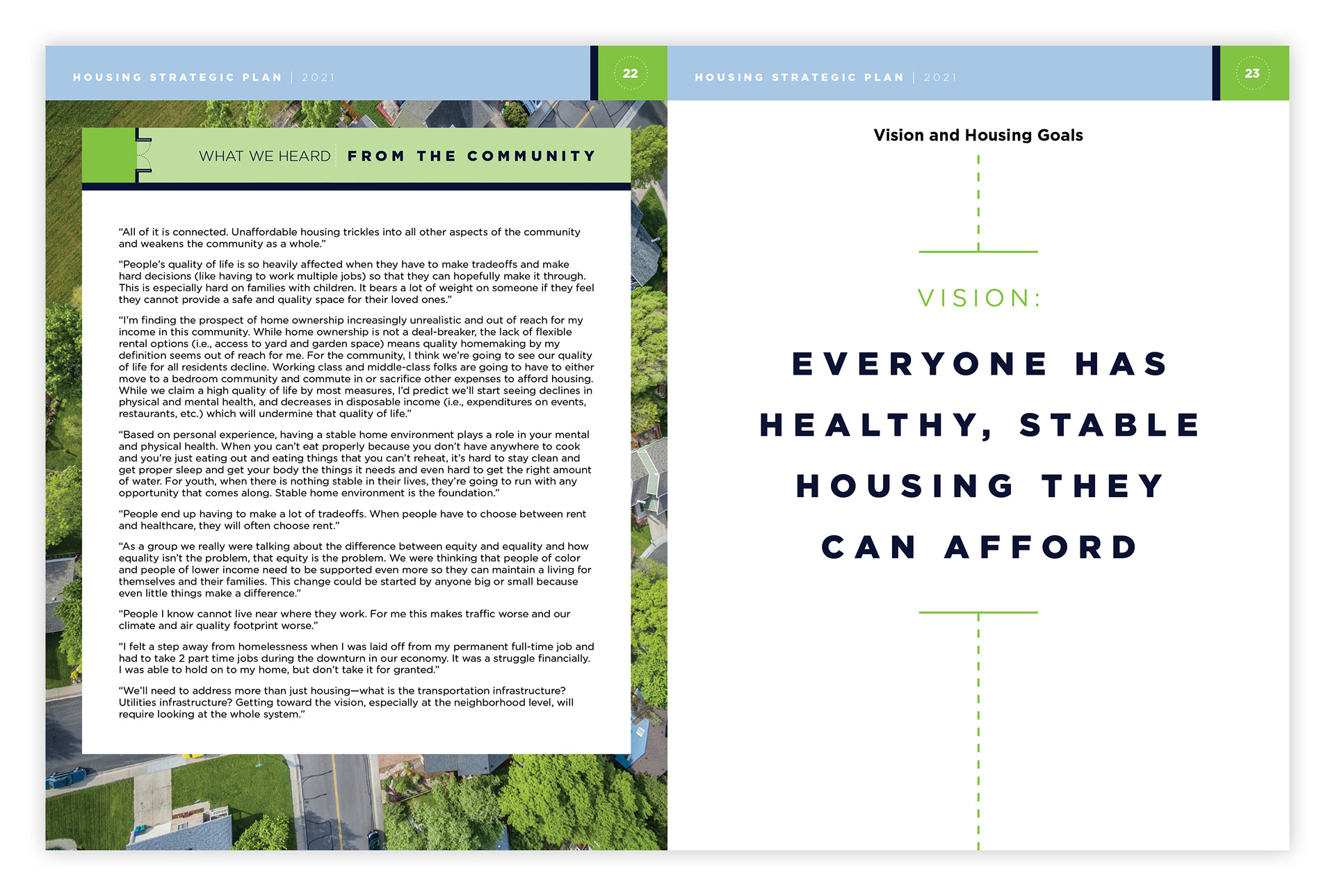
Example of a typical spread with callback links and footnotes.
Example of a section divider spread.
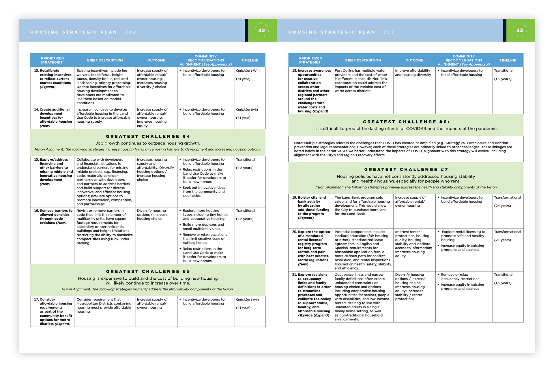
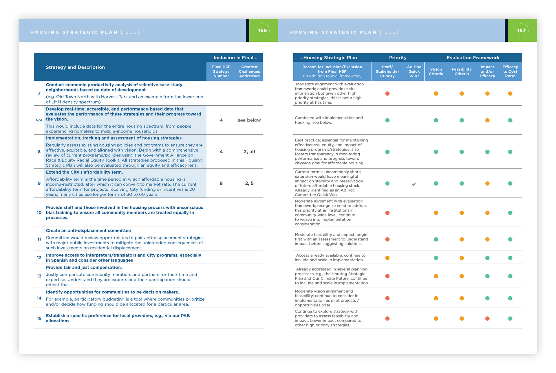
Example of a table page. As you can imagine, these were a bear to transfer from Microsoft to Adobe.

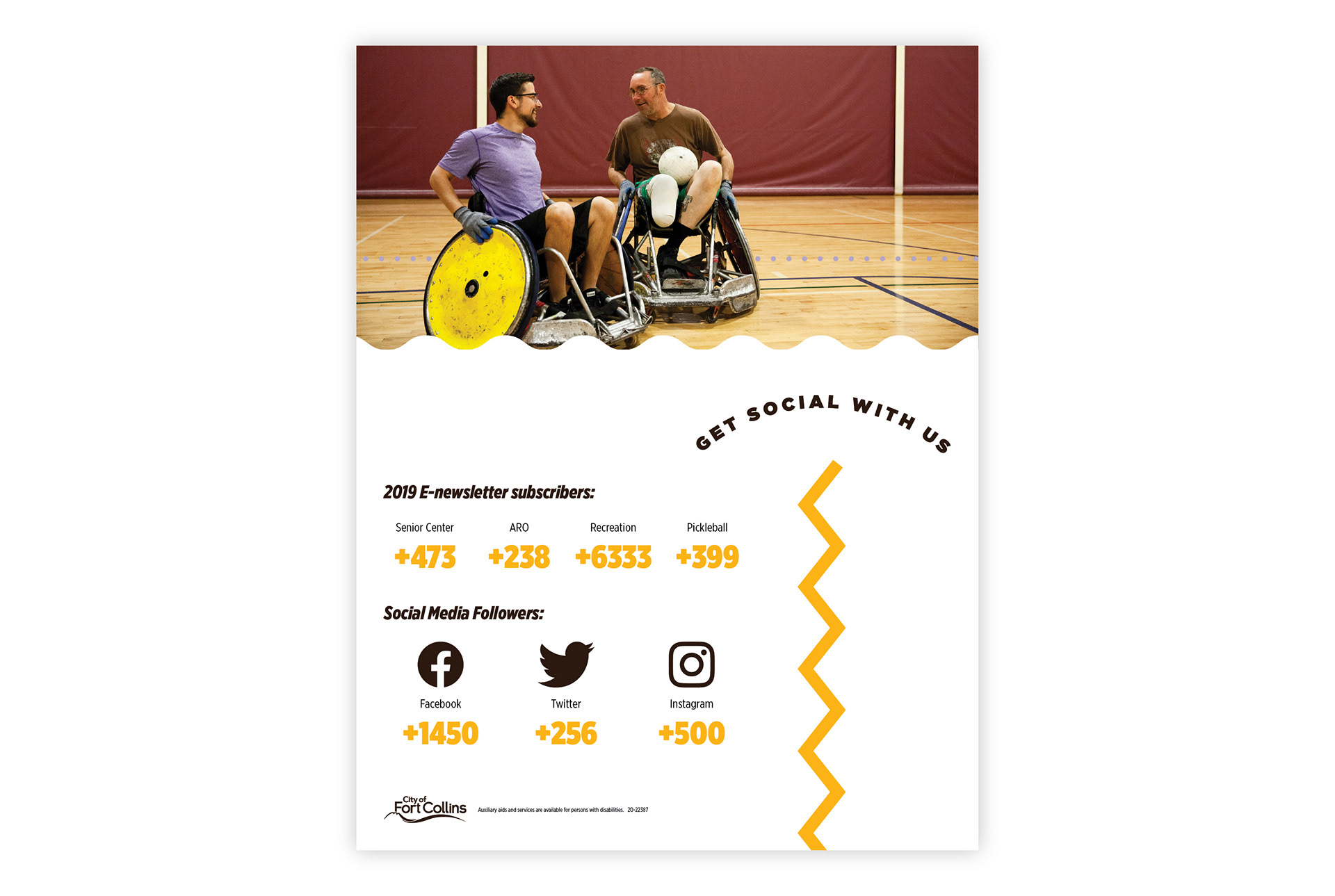
During my time, I tried to create different looks for each of the different areas of the city. Although every single piece used the same type family (shout out Gotham!) and the same color palette, distinct personalities started to take shape. Parks and Recreation was meant to feel a little more playful, as evidenced in this annual report.