

For FoCo was another arm of the CIty of Fort Collins' outreach during the pandemic. I was assigned to create something that fit in with 'For Fort Collins,' which was a separate more business-focused campaign based around the location pin shape. This mark mantains continuity with that campaign, while feeling more approachable, familiar, and people-focused.
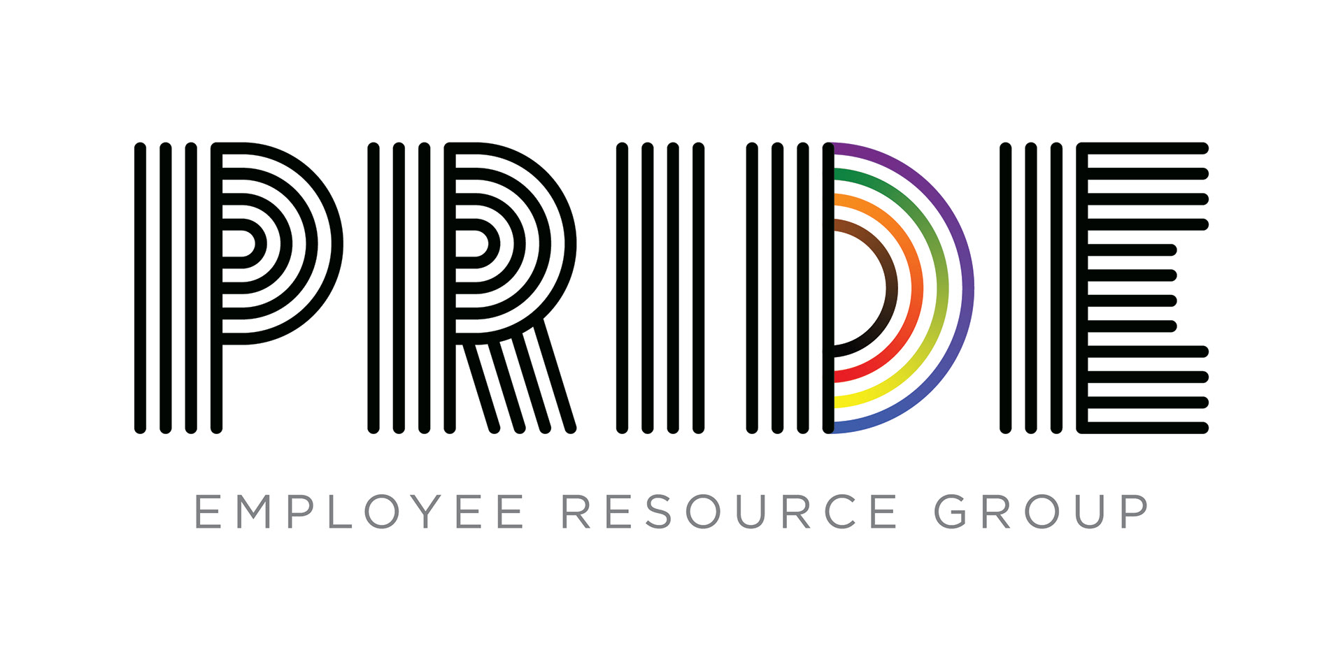
The Pride ERG is an internal support system for City of Fort Collins employees who identify as LGBTQ+. I hid some rainbows in their logo and had a great time doing it.
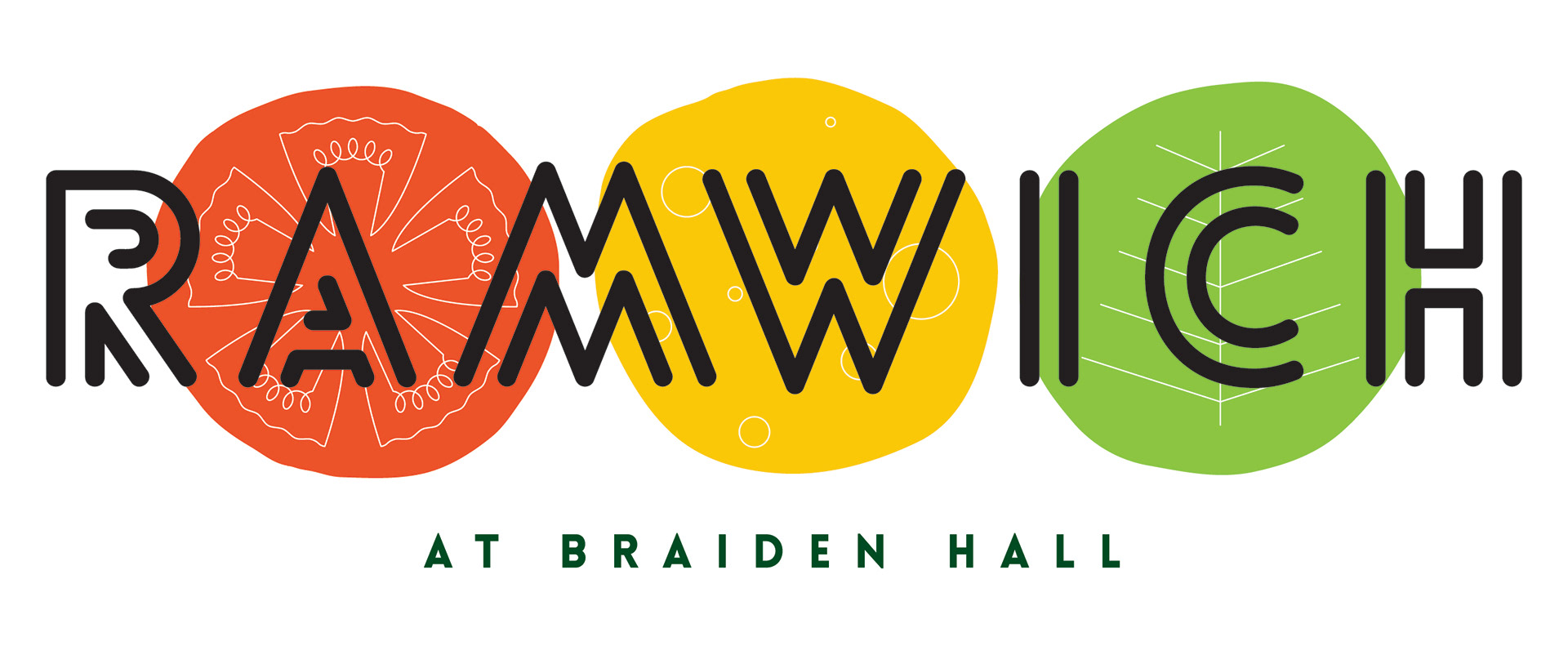
Ramwich is an on-campus sandwich shop at CSU which utilizes a grab-and-go model complete with advance ordering. To highlight that speediness, I laid out these sandwich ingredients to mimic a traffic signal. Even if you don't catch the reference, it still looks super fresh and tasty.

CASA is a property management company in Lincoln, NE. They approached me with a pretty wide-open brief, so I created this row of little dwellings for them.
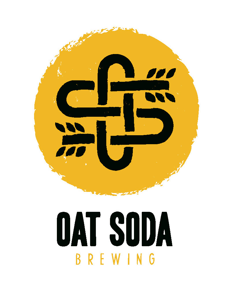
Right now, Oat Soda is just my buddy Mike making great beers in his garage. He's got the talent to go big, and if he does, he'll look great doing it with this logo. We've already slapped it on a shirt, and done plenty of market research.


Thermosa is a multi-faceted business founded in California with a focus on photography and tech consulting. Their name was inspired by the long walks that the founders would take as they talked about their dreams with thermoses of mimosas in hand. They wanted two logos that would work well together, but also accurately portray the focus of each side of the business...all while maintaining that juicy citrus deliciousness.

Environmental Eats is a regular series of events occurring in the dining centers at CSU. They wanted to give the impression of healthy food without tying it to any one ingredient in particular. Thus, the mighty forkplant was born.