
A few additional spreads from the last two years of the magazine


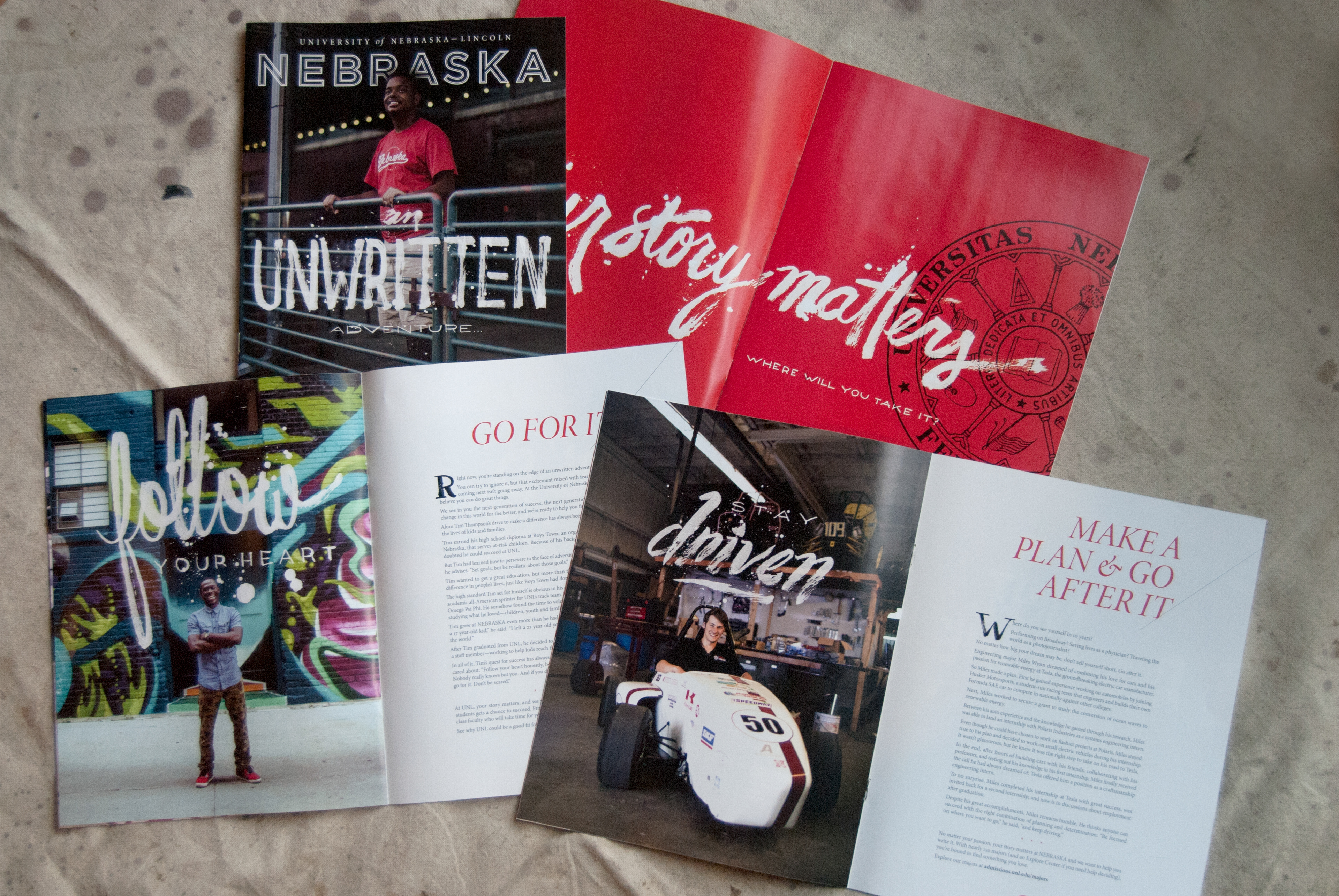
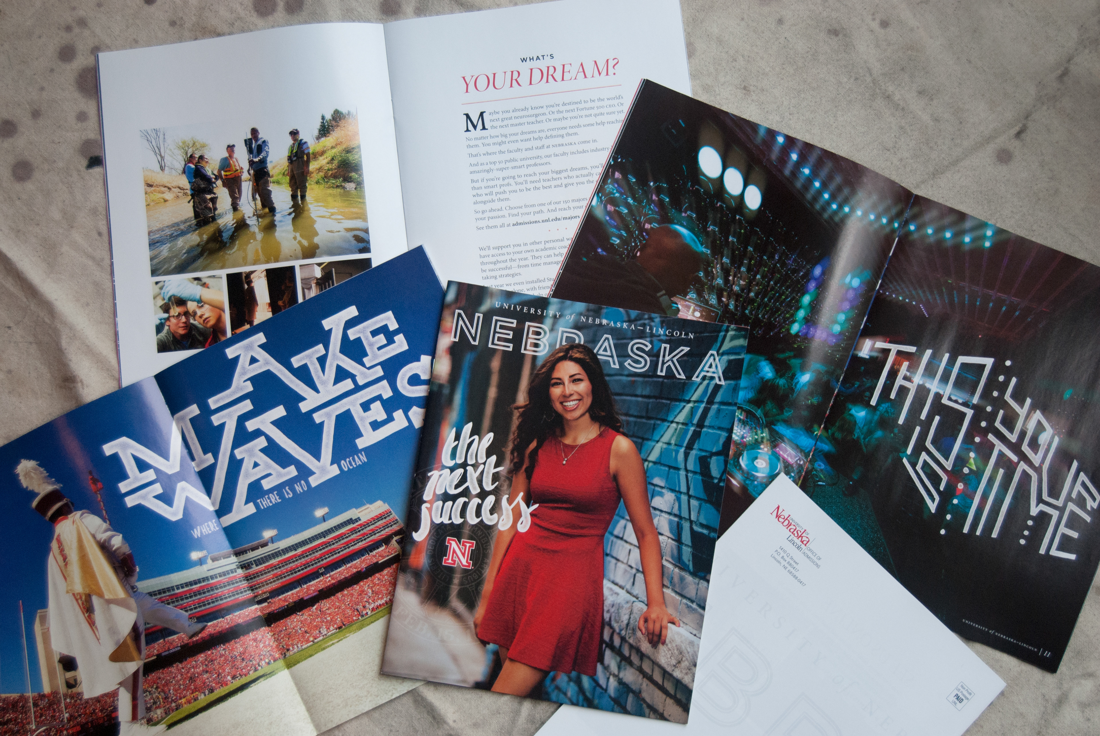
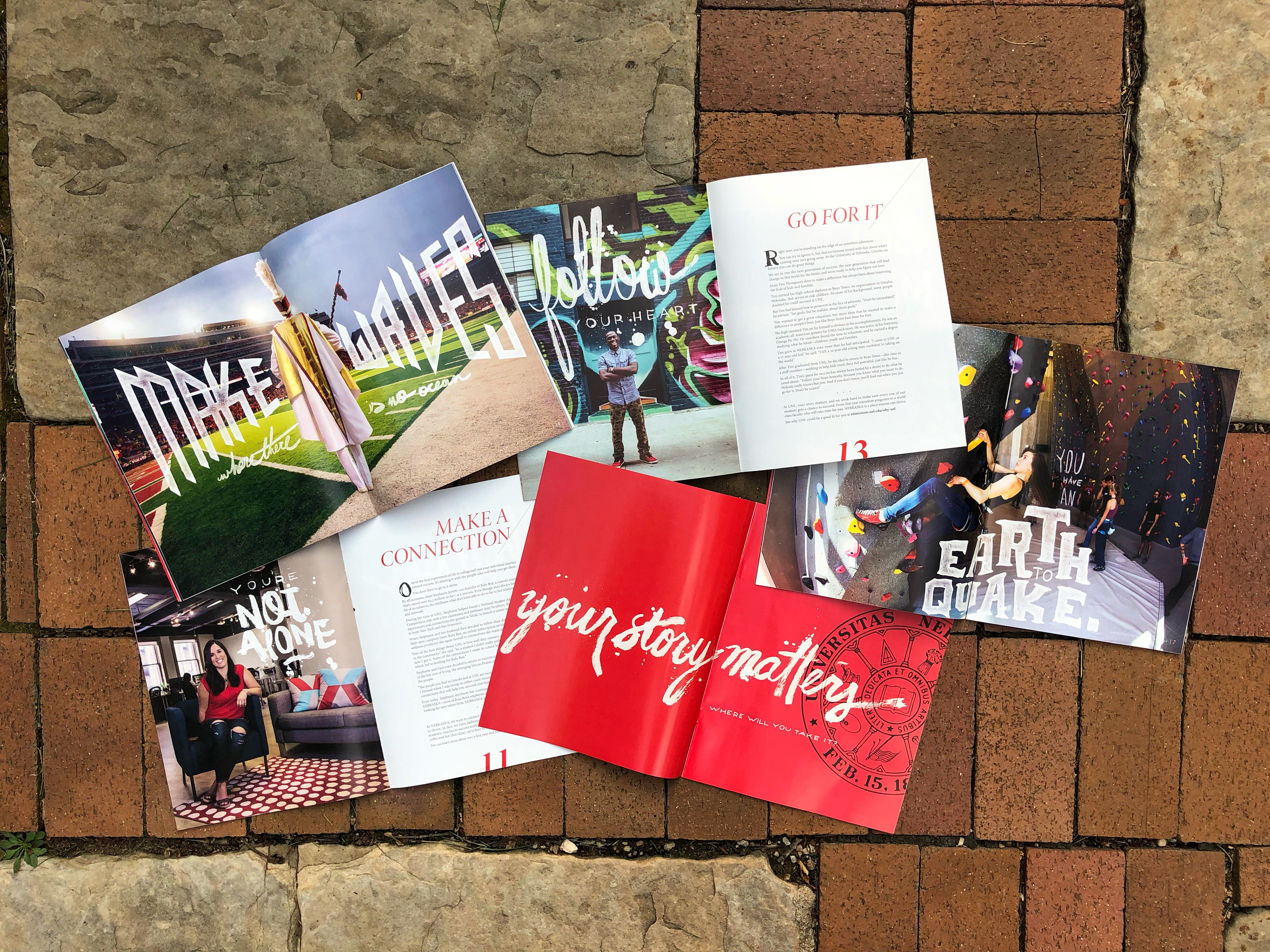
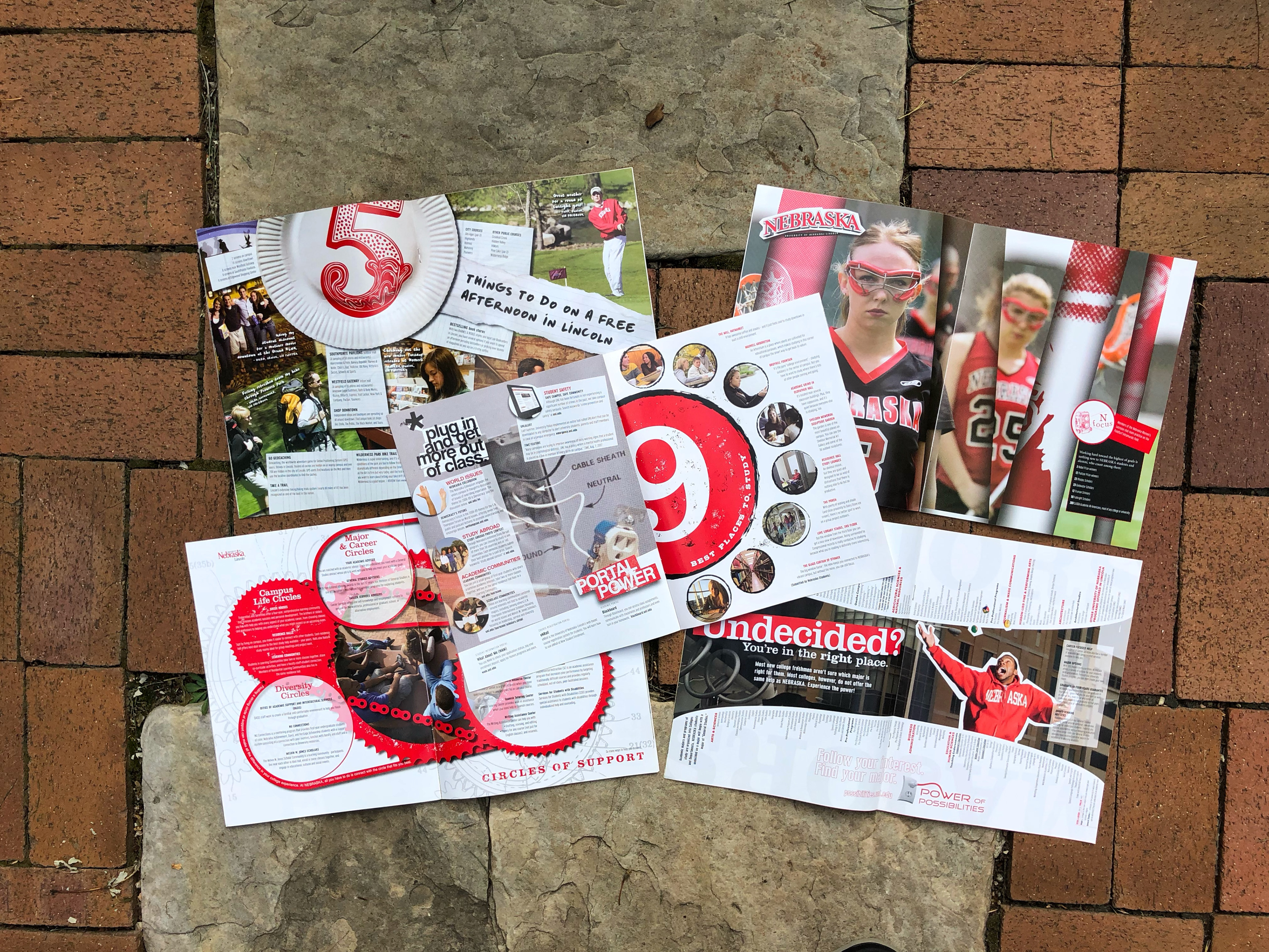
These are a few spreads from the middle few years of my helming of the magazines, where we took more of an advertising-based approach. Each concept that we wanted to communicate was treated as a separate piece, and flipping through each issue became an engaging experience with a new feel on every page.
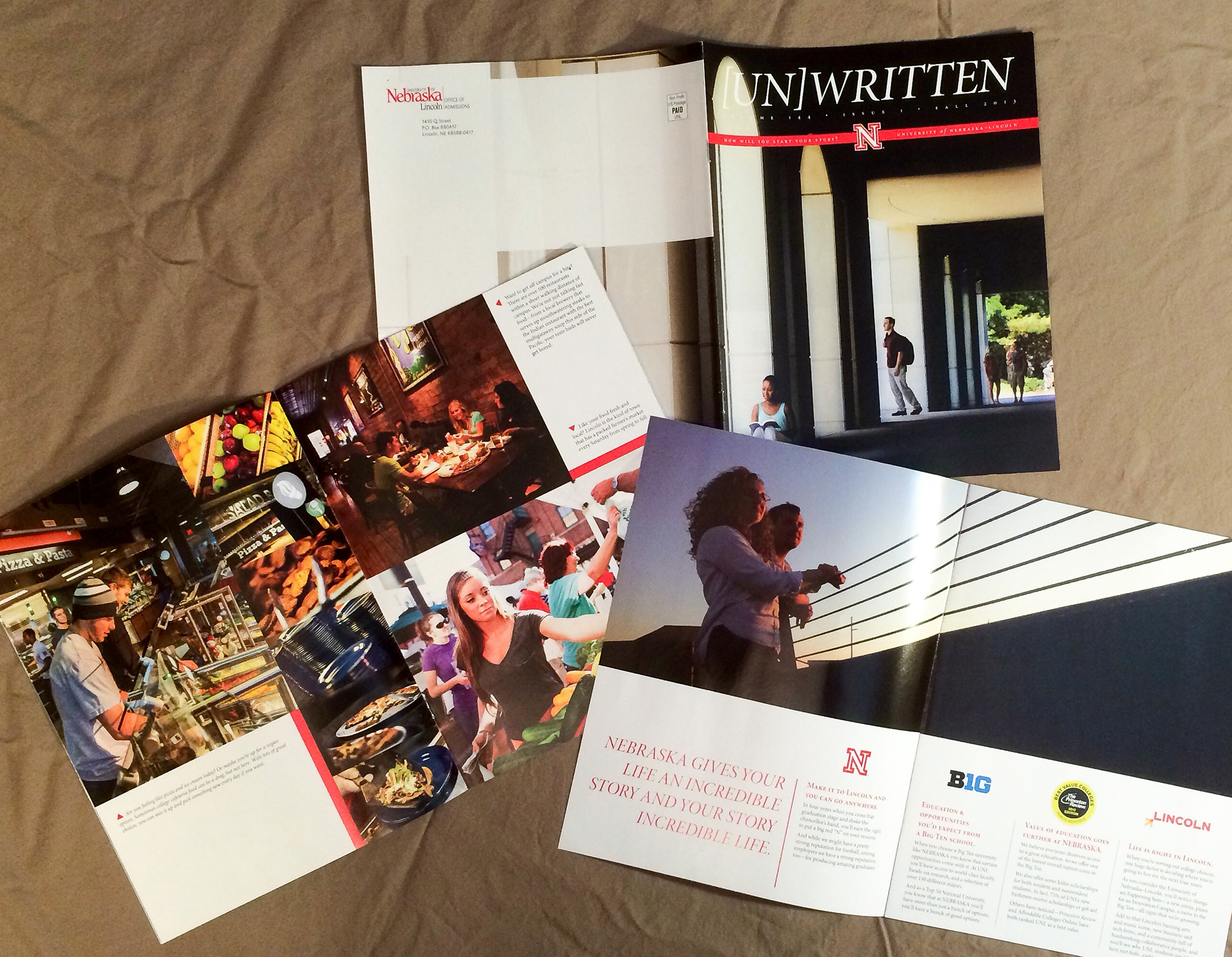
These are a few spreads from my first couple of years helming the magazine, which was actually given to me before I became the senior designer. It was my first year out of college, and I was overwhelmed with four full-length magazines suddenly sitting on my plate. It was definitely a learning experience, but I'm proud of the final product, and we heard from a lot of prospective students that they loved the new look.
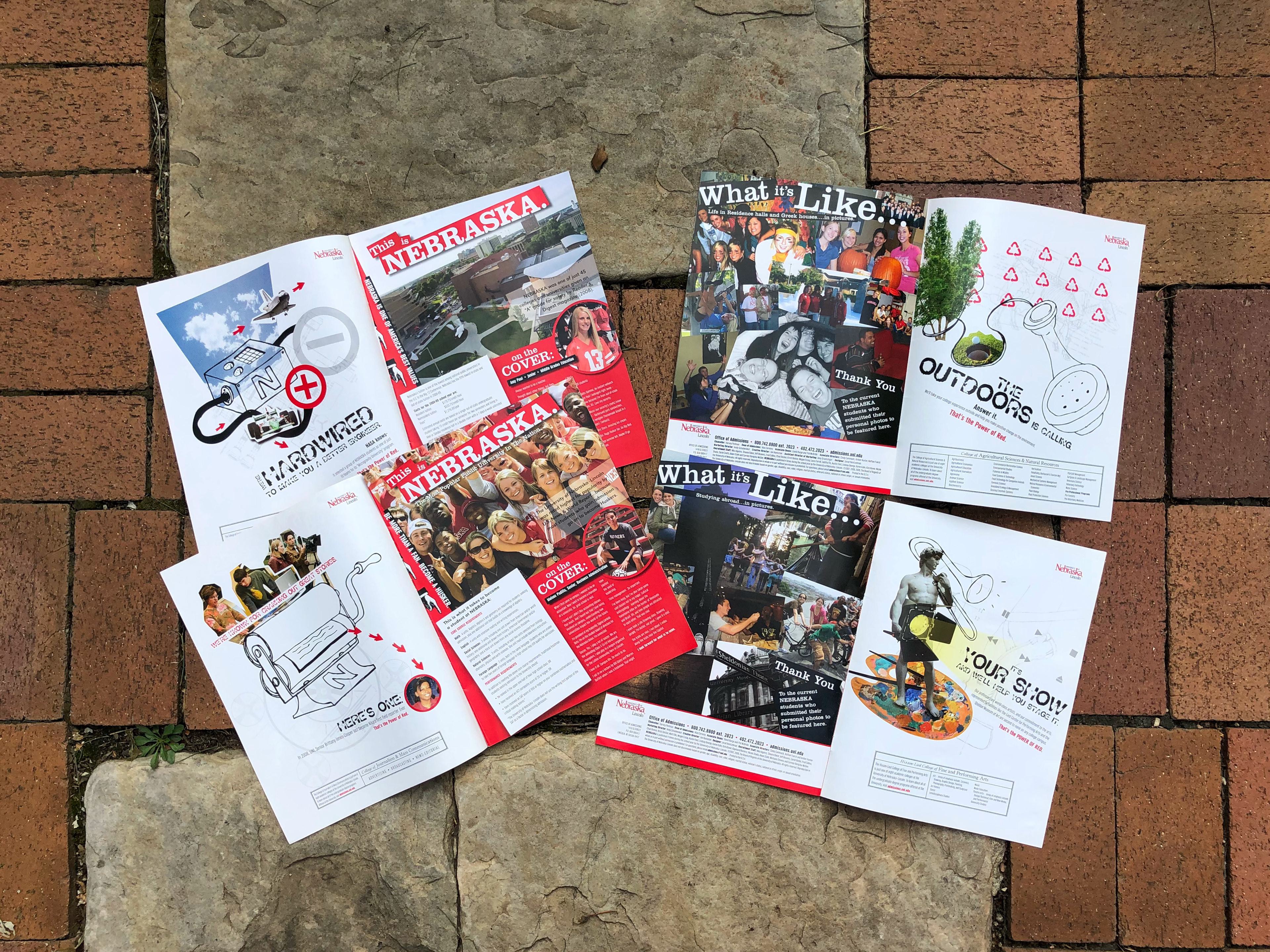
A few of my favorite features from the first few years of the magazine were the individual college ads on the inside covers, the 'What it's Like' spread featuring student-submitted photography, and the interviews we did with our cover models.

In all, I helmed the magazine for 8 years. You can see the evolution of the design here on the covers. I did all of the design and art direction, I handled all of the lettering, and even directed a large number of the photo shoots. I'm proud to say that we always met (and often crushed) our enrollment goals during these years.
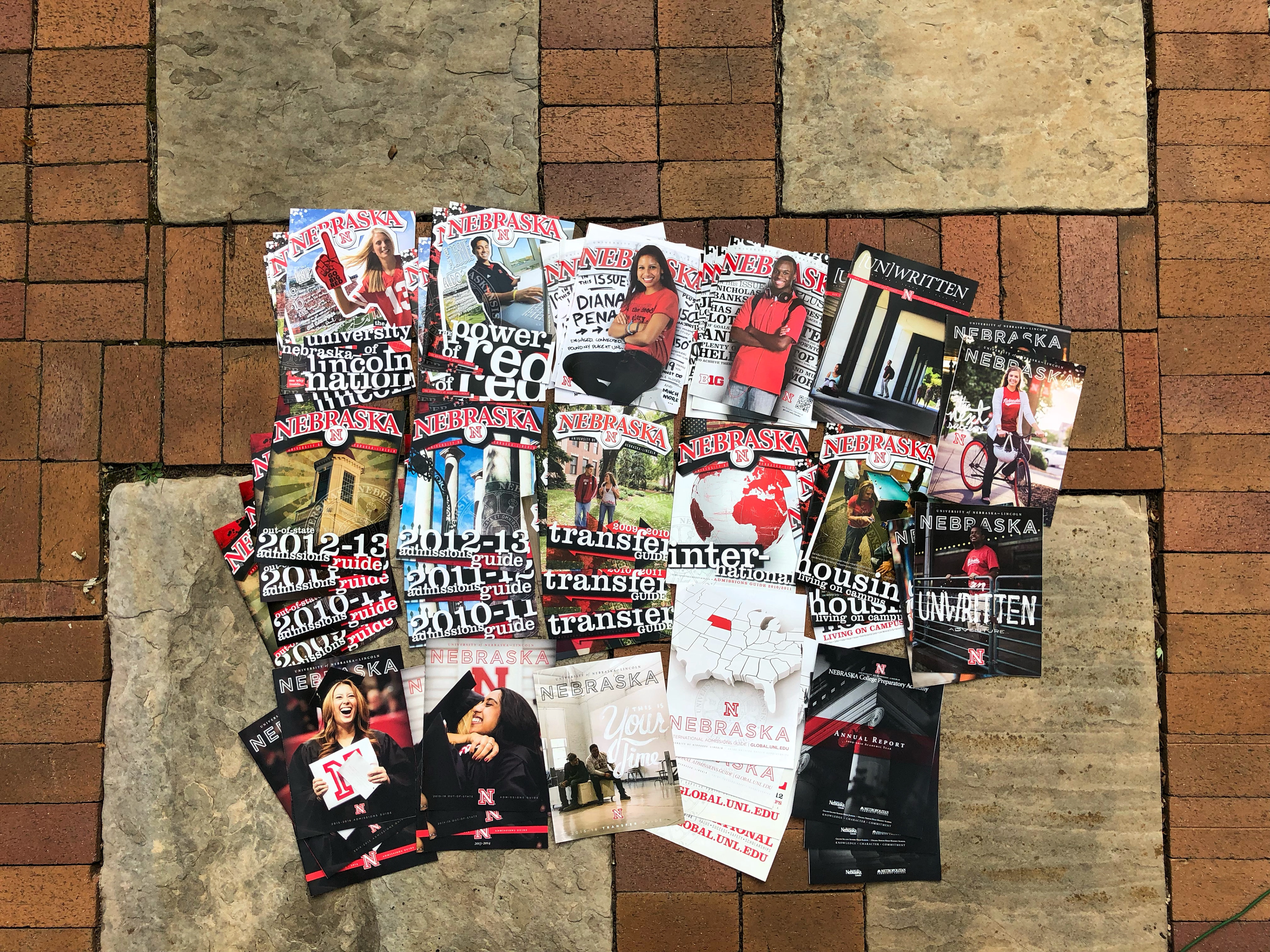
In addition to the magazines, we also did Transfer Guides, International Guides, Housing Guides, Admissions Guides, Multicultural Guides, and Annual Reports. Every piece multiple pages, and updated every year. Every piece designed by me. And that's to say nothing of the countless postcards, posters, and smaller brochures. It was an insanely fast-paced time, but such a valuable experience - both in working hard and in how to art direct entire large campaigns as one coherent unit.