
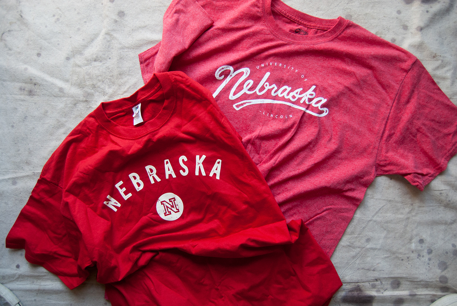
T-shirts! On the left is a general purpose giveaway shirt; the shirt on the right was sent to high-achieving students as an extra bit of recruitment.

T-shirt detail.

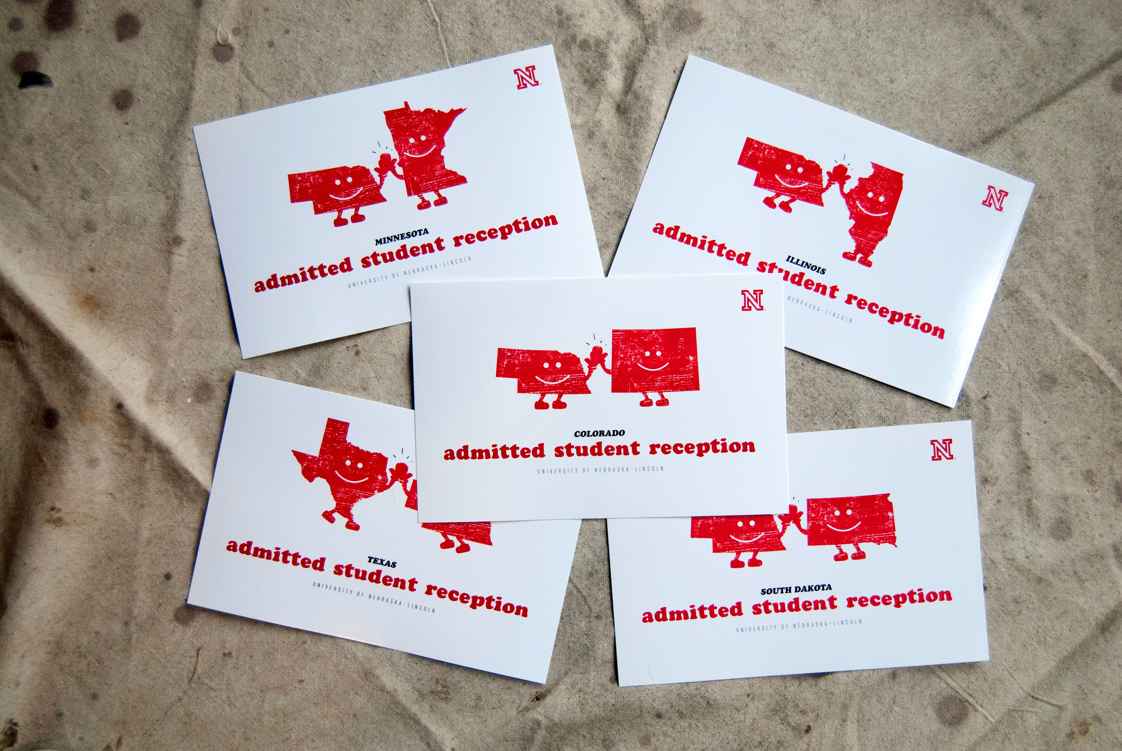
This small card was created as a handout to talk about a new scholarship opportunity.

Detail shot to show the raised lettering on the front of the card. This beautiful effect was created by using a spot UV coating, applied only over the letters.

True Red was a program created to encourage students to pay their enrollment deposit early. Those that did were part of an exclusive club that received the merchandise pictured above, free of charge (among other perks).
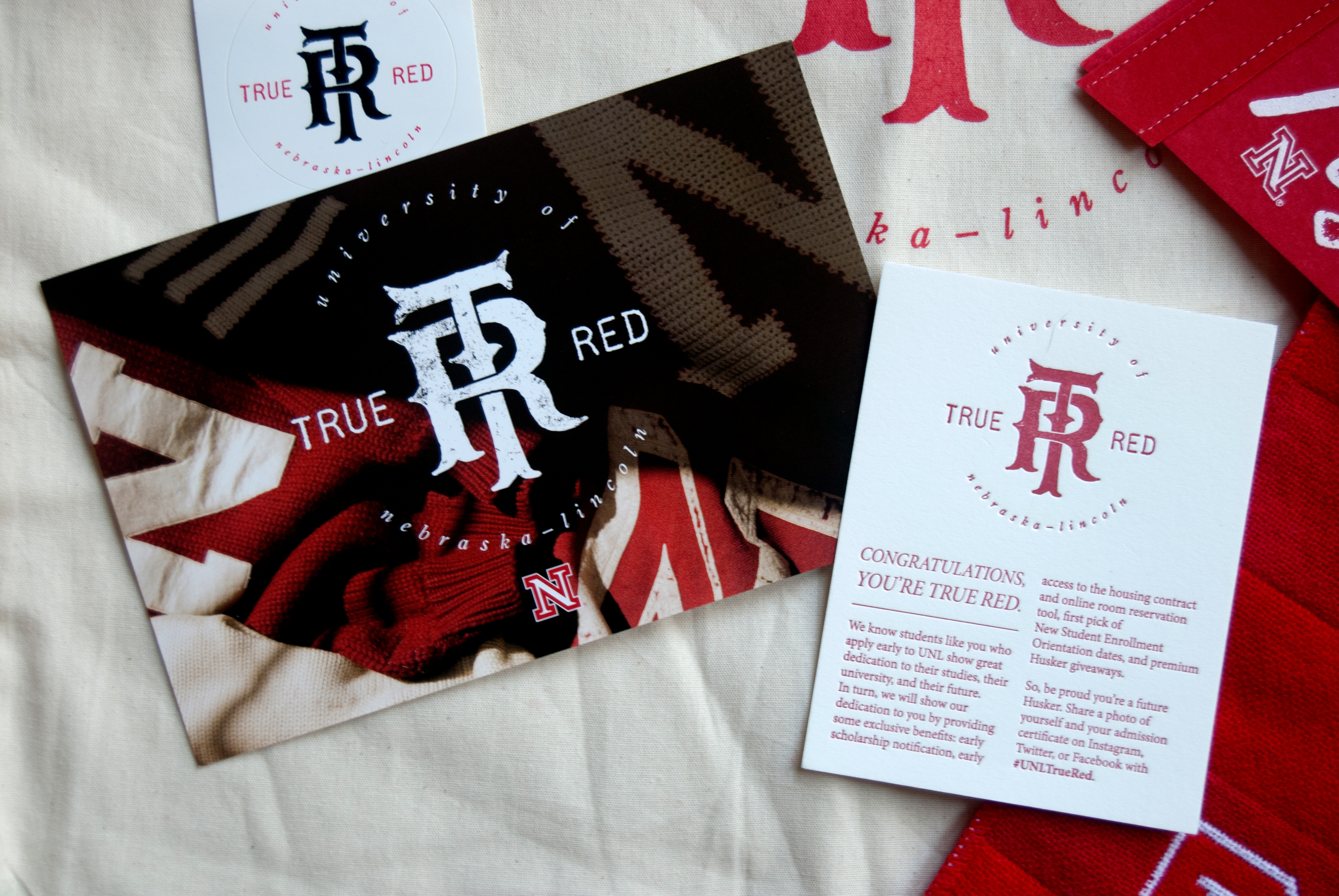
Detail shot of the True Red graphics.
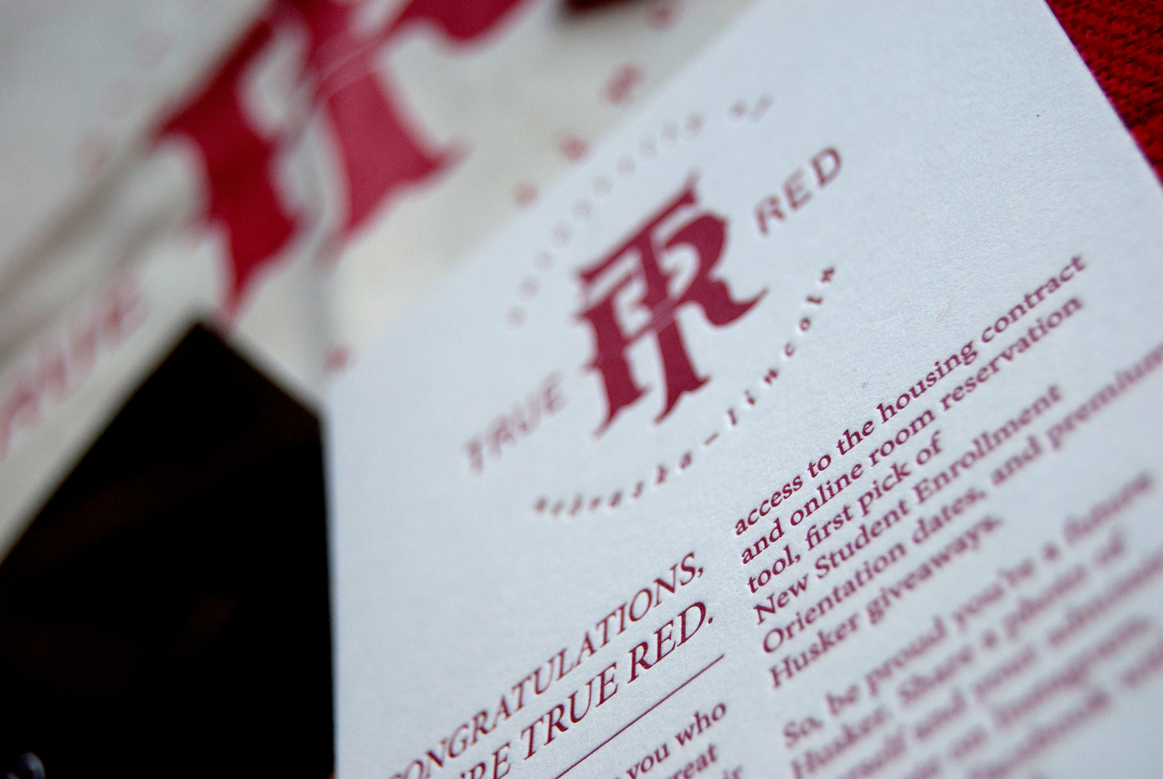
Detail shot of the True Red confirmation card, which was letterpressed to lend it a feeling of special significance.
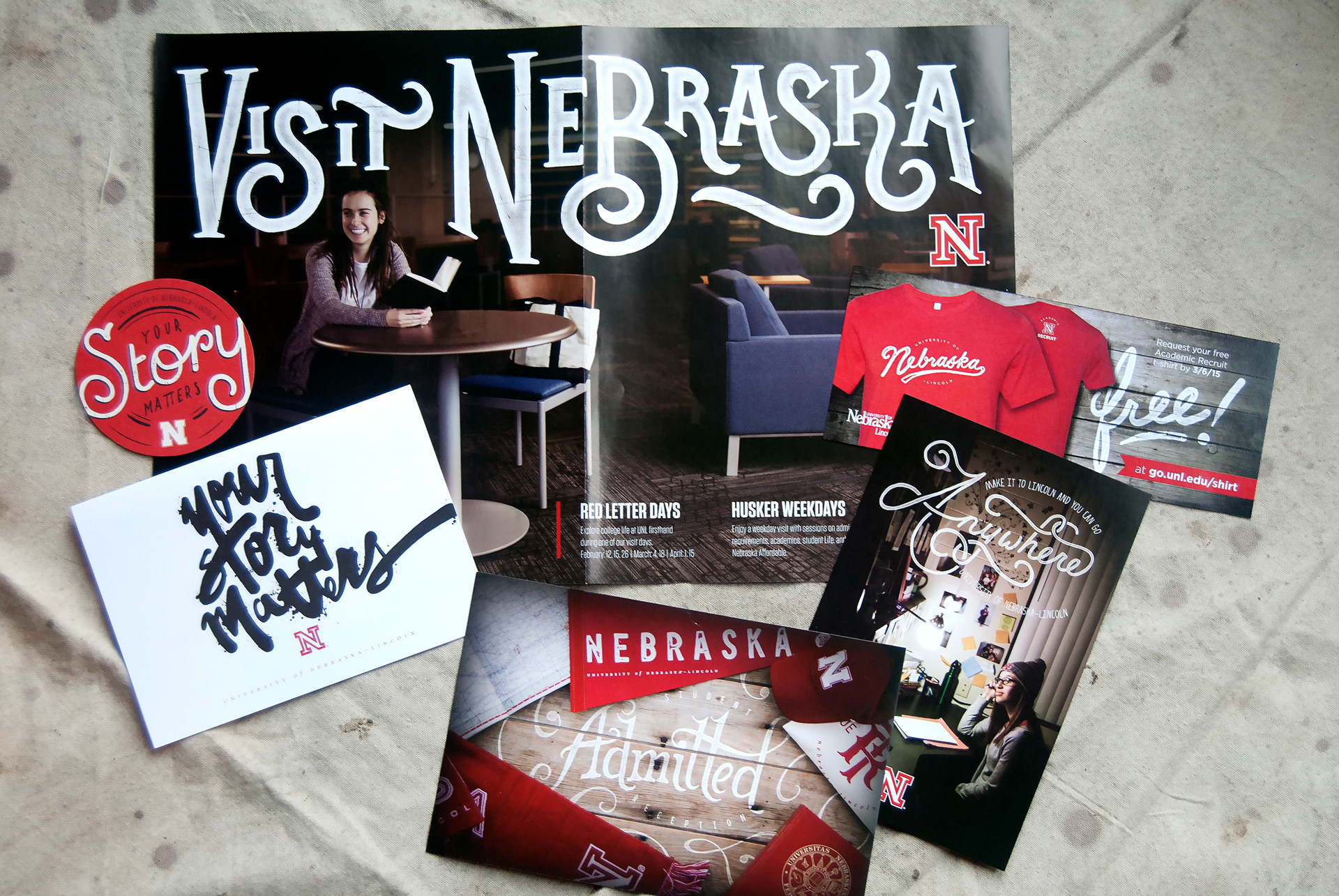
A collection of materials all featuring our signature hand-lettering style.
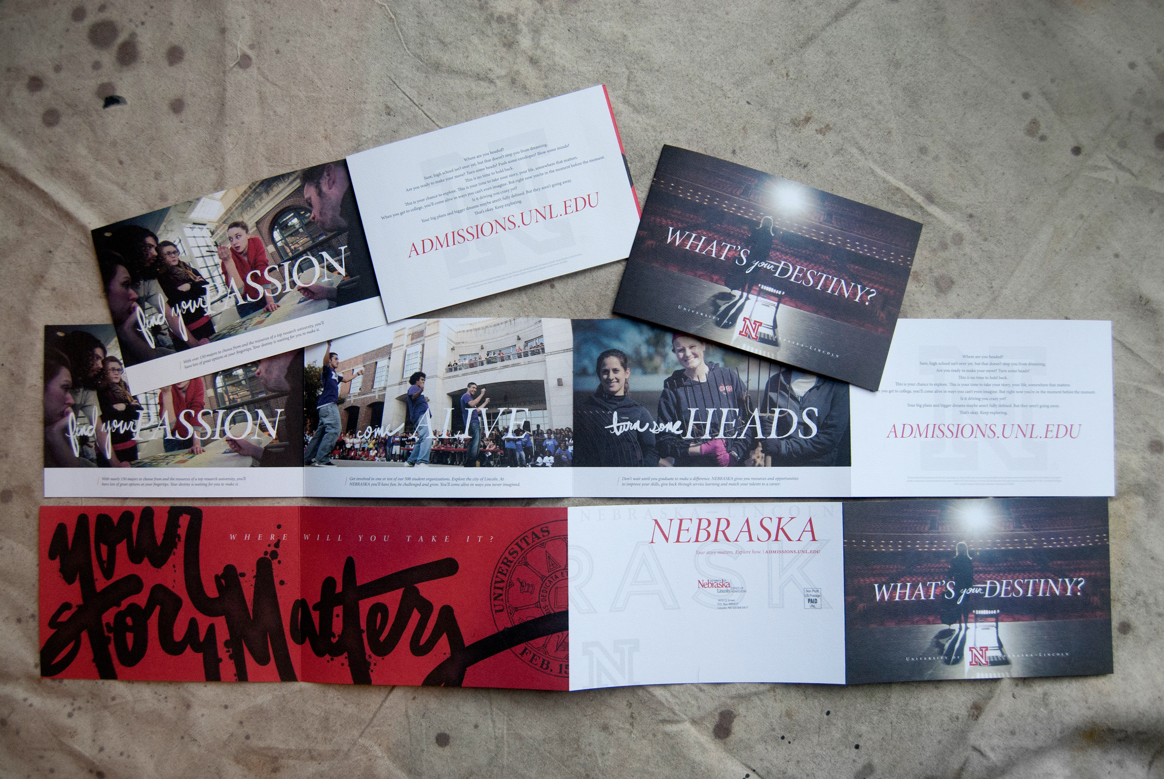
This is a self-mailer which unfolds one panel at a time to deliver a unique brand experience.
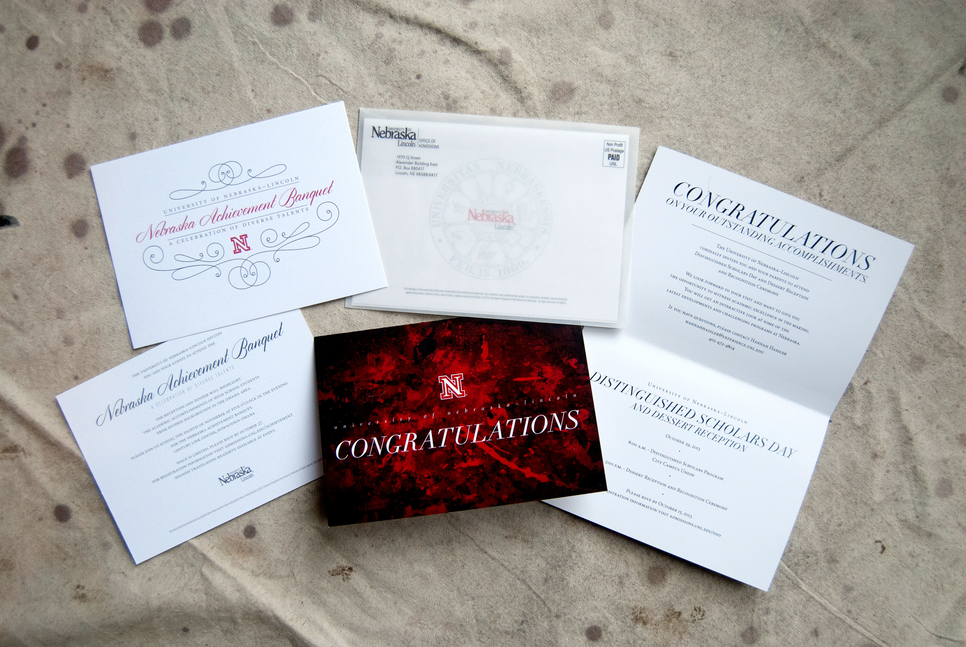
These are two invites for events specifically intended for high-achieving students. In a moment of creativity, I turned a photo of a dirty painting classroom floor into an elegant cover for a prestigious event invite.
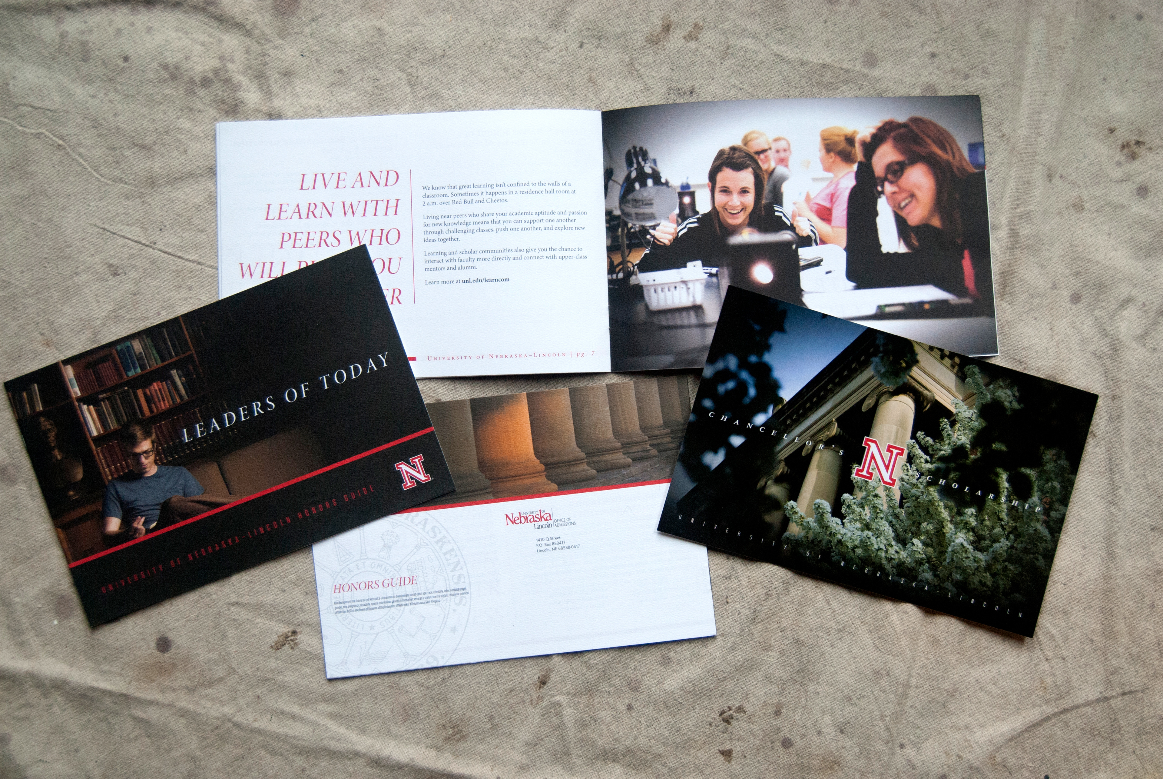
A few more publications for high-achieving students. As with everything that goes to this particular audience, I aimed to achieve a look of higher distinction that still fit in with our larger brand.

The International Baccalaureate program can be somewhat intimidating to navigate. These pieces help to explain it concisely and attractively, while maintaining the cachet inherent to the program.
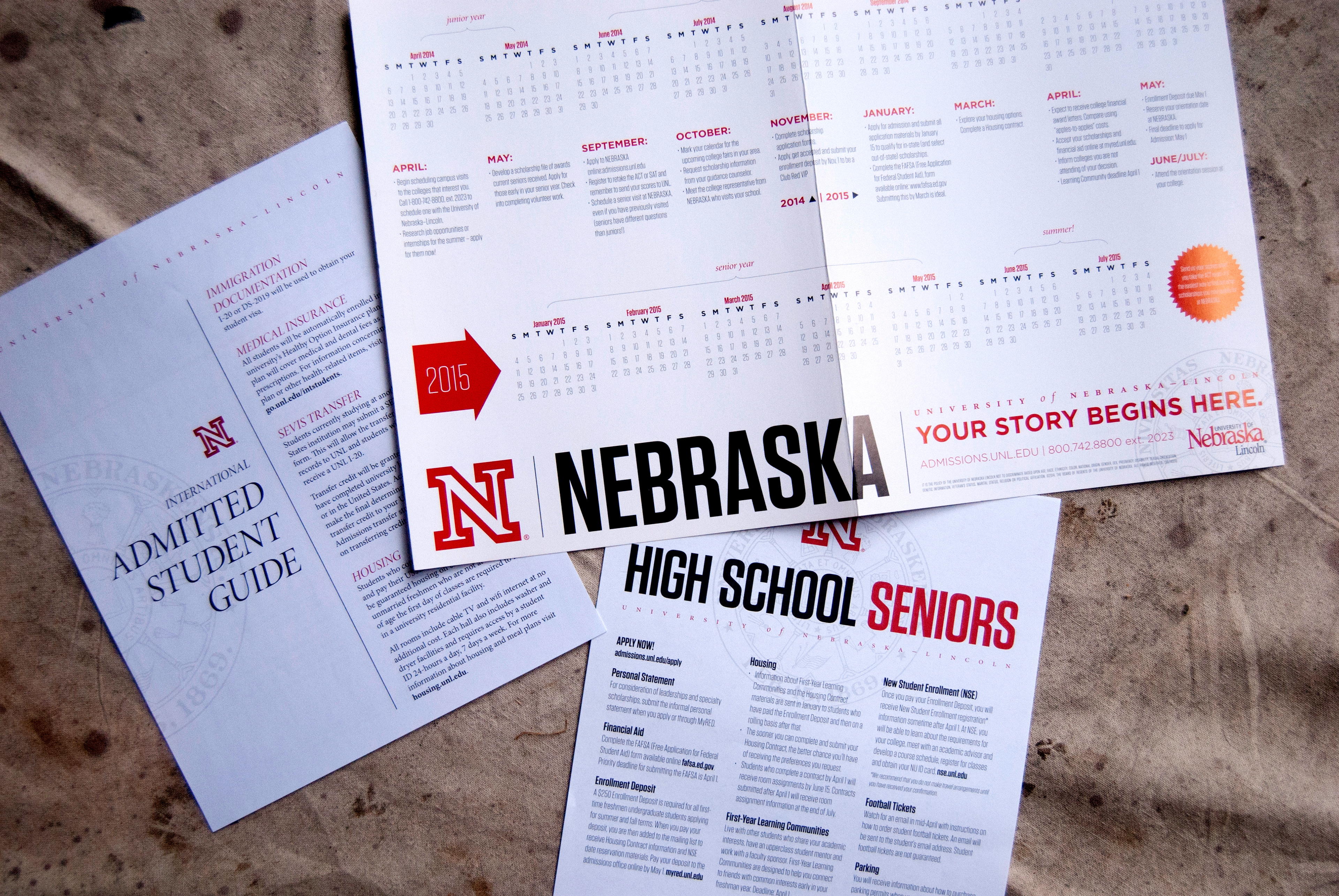
Even when a piece is strictly meant to deliver important information, it can still be made beautiful through the careful use of space and typography.
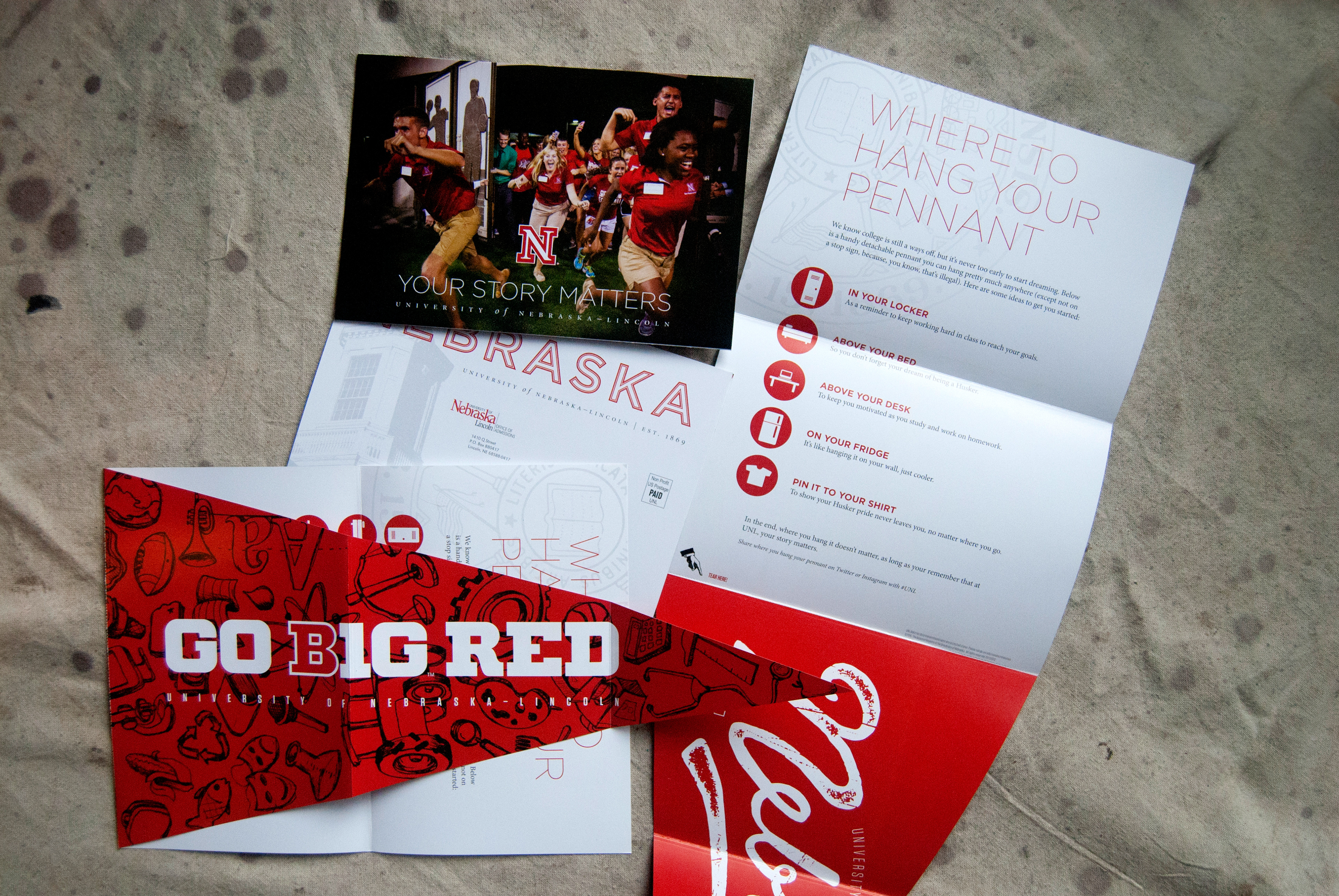
This is another mailer which arrives in a standard postcard size, but unfolds to be something much more. The pennant that this piece contains can be torn off at the perforations, and hung in a locker or future Husker's bedroom.

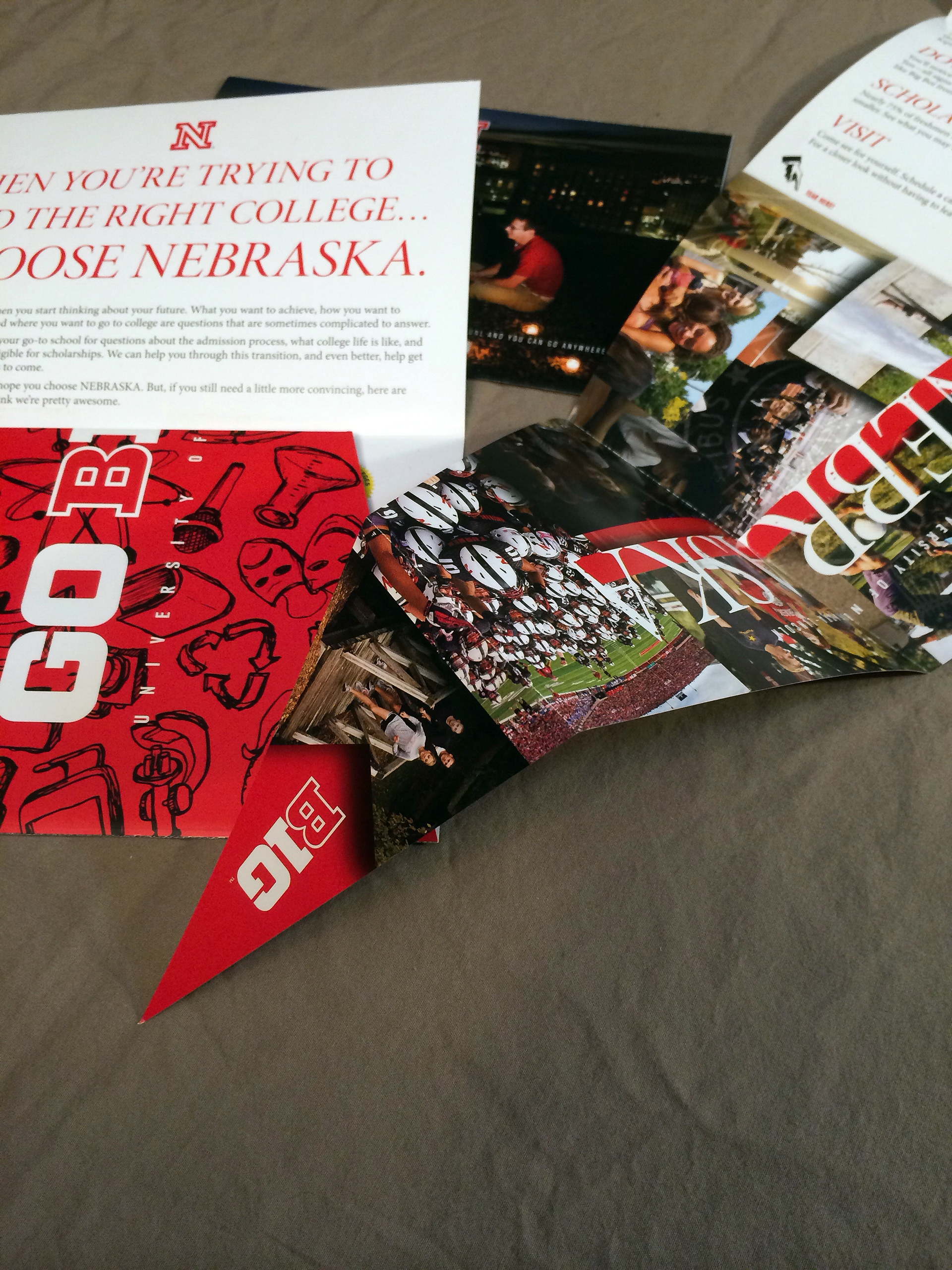
This is the 2013 version of the pennant mailer.
Detail shot of the pennant mailer.

Detail shot of the pennant mailer.
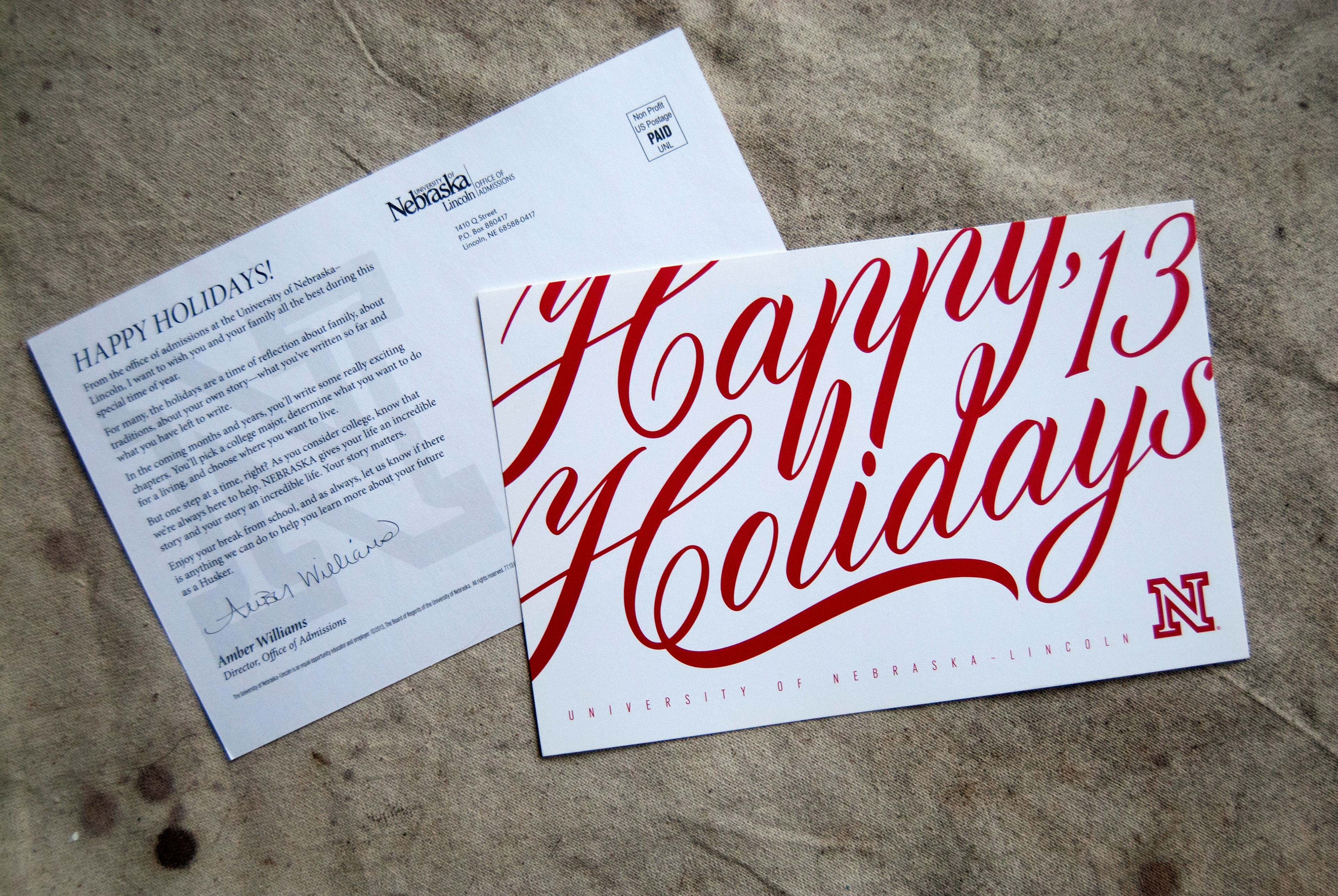
Holiday postcard from 2013, featuring custom-drawn type embellishments.

This detail shot does not do justice to the spot varnish and metallic ink we used for the holiday card.
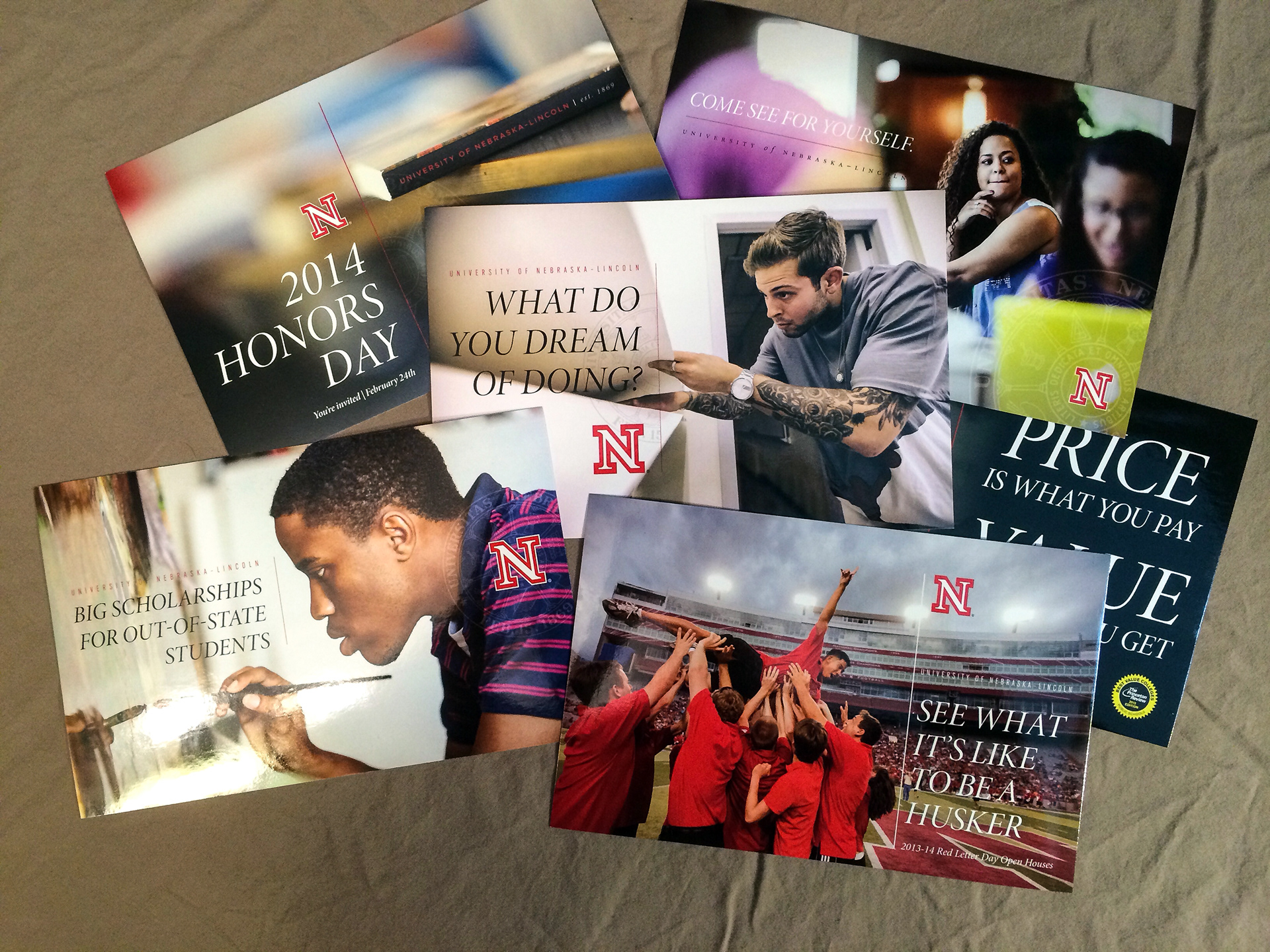
Even for our simplest postcards, I wanted to create a look that stood out through the use of bold photography and typography.
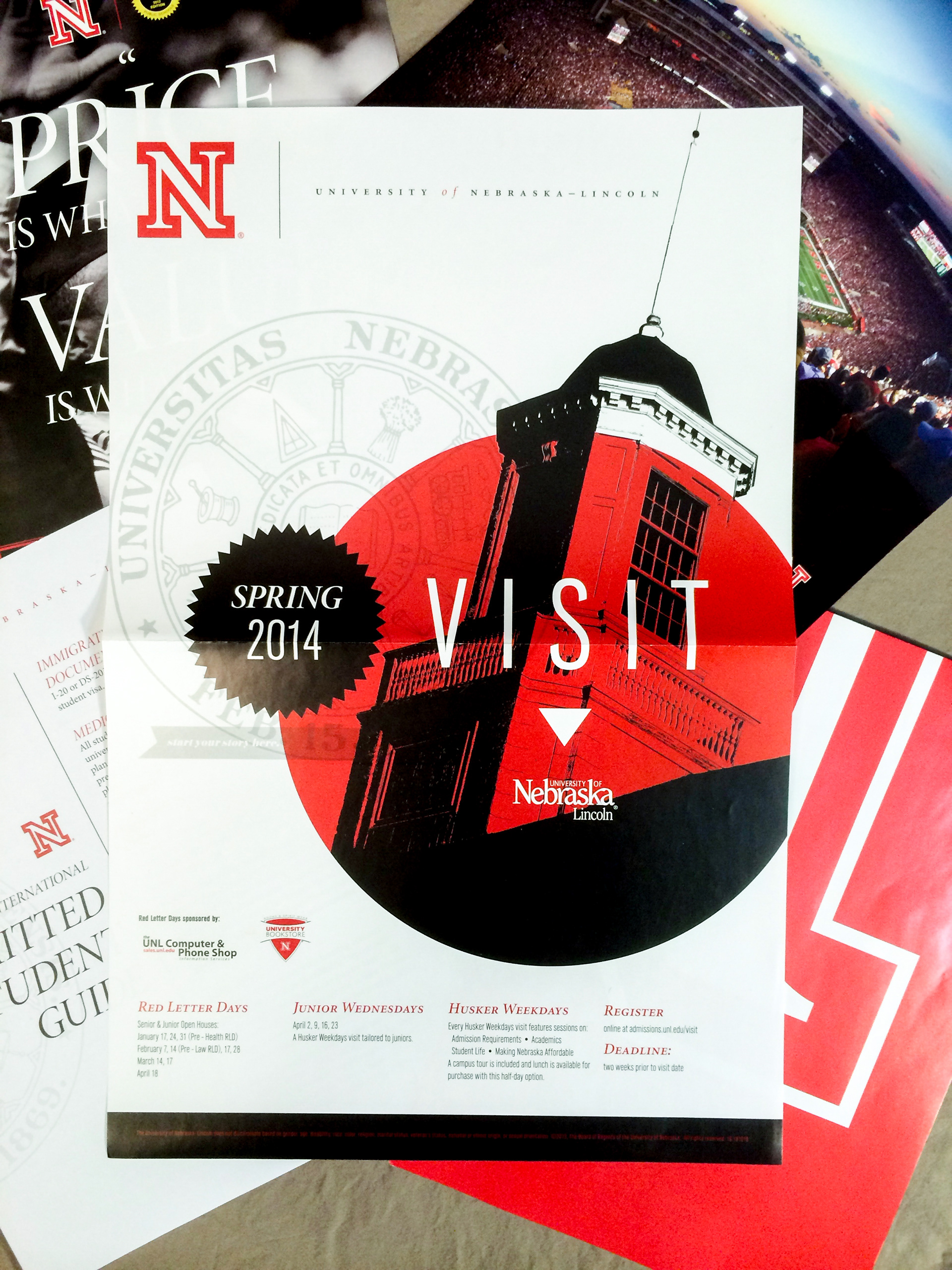
Spring visit poster 2014.

The directive for this piece was to create a logo poster that used to back side to deliver some key brand messages. I aimed to take it a step further, and created something that hopefully makes the recipient have to double think which side of the poster will be facing out when they hang it.

Detail shot of how the poster folds down.
Now that's just fun.